Project Overview
A&J Upholstery is a service that allows users to find an environmentally friendly solution to restore worn and weathered items of furniture. Currently, when owners wear out the fabrics of their furniture, many items end up in the streets and eventually landfills impact our environment negatively. A&J Upholstery aims to fix the problem by providing a restoring service which will bring new life to these items, bringing pride and joy to owners and easing the growing landfill problems which contribute to fuelling climate change.
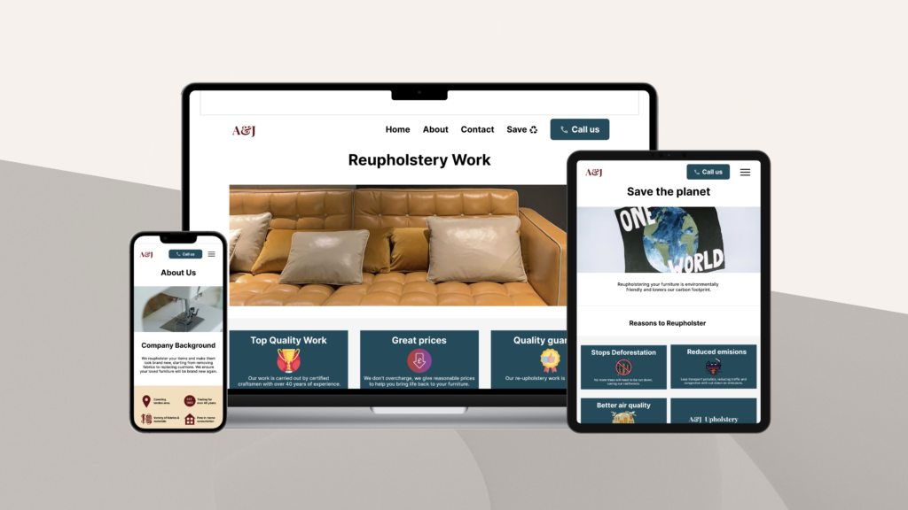
A&J Upholstery Responsive Website
My role
UI/UX Designer, Research, Wireframes, Prototypes, User testing. Tools used: Figma.
The Problem
The Problem
Furniture owners throwing away damaged furniture like sofas and chairs, leading them to end up on land sites. Increasing pollution and making them spend high amounts on purchasing new items.
Solution / Project Summary
The website offers users the ability to book a consultant to carry out reupholstery work. The aim is to have more people recycling and restoring their damaged furniture instead of throwing them away and increasing pollution.
Design process

Understanding The User
To start the design process, I wanted to gain an empathetic understanding of the problem that I needed to solve. Focusing on identifying who the users are, what their needs and motivations were, I used the following methods to research and understand their needs;
- User interviews & competitive audits
- Personas
- Problem statements
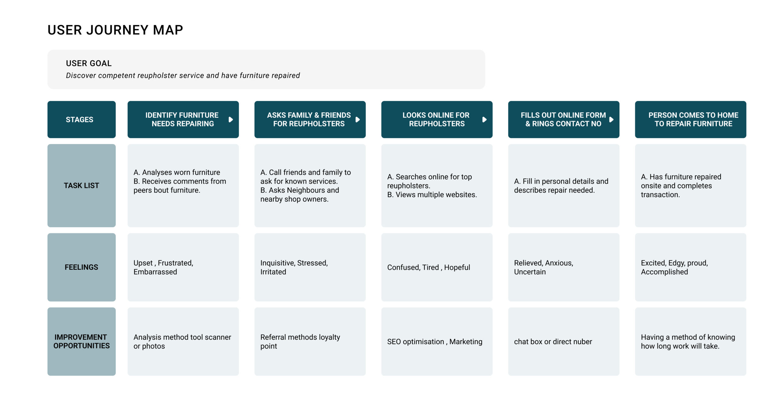
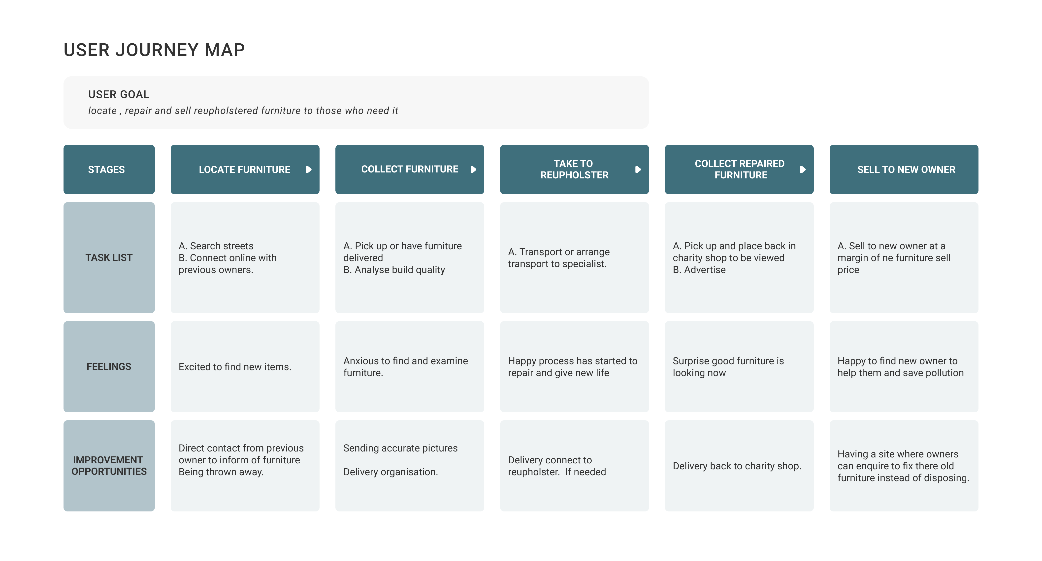
- User journey maps
User Research: Pain points
- Users wanted a simple, uncomplicated process of contacting the business.
- Users wanted to be able to find contact details easily.
- Users wanted to view actual work items and disliked cramped sections.
User Research: Summary
I discovered that many users have no idea that an upholstery service exists and simply throw away and replace old furniture when they have issues such as tears and weathering.
I discovered many users would love to repair their existing furniture for a fraction of the price, especially if they are aware it is good for the environment.
Personas and Empathy Maps
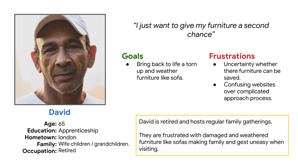
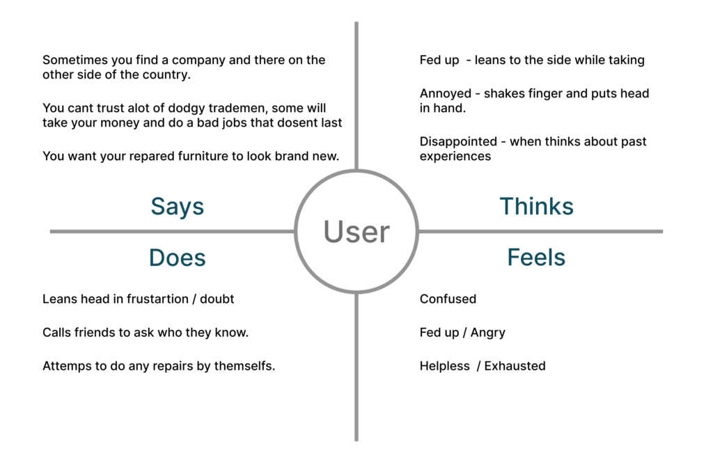
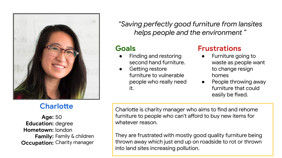
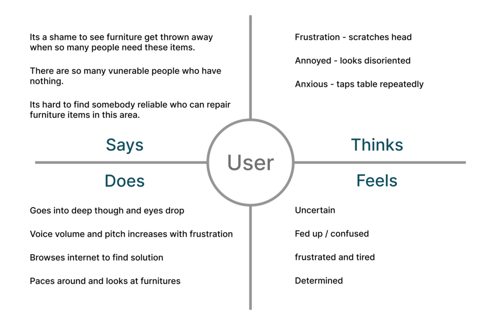
Using results gathered from user interviews enabled me to understand pain points and create personas focused on whom the typical user would be. This enabled me to stay on track during the design process to address needs and solve the users’ problems.
Persona
Empathy Map
Journey Map
Persona
Empathy Map
Journey Map
Problem Statement
After combining and understanding the needs of user goals and frustrations through research. I synthesised the data and formed a problem statement; I used this as a guide and reference point during the brainstorming and idea-generating phase.
“The furniture owner needs an easy, accessible and convenient way to repair worn and used furniture to help save the environment, because they are frustrated with having to throw away furniture, adding to land sites and contributing to increased pollution, incurring expensive replacement costs”
Ideate
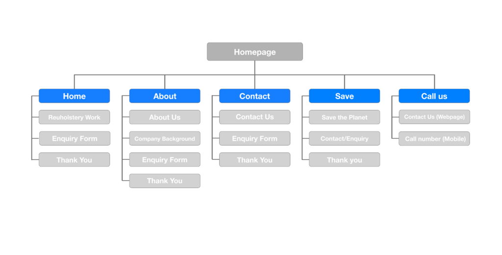
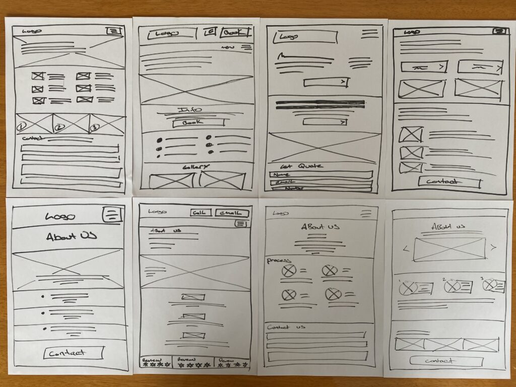
Sitemaps and paper wireframes were used to brainstorm and build on ideas. This enabled me to visualise the architecture hierarchy of the responsive website and create multiple screens of each page, choosing the essential features needed to be incorporated into potential layouts and final wireframes.
Users wanted to contact the business easily and disliked over-complicated and cramped sections, so design solutions were created around these pain points.
Sitemap
Paper Wireframes
Low Fidel Digital Wireframes
Moving from paper to digital wireframes made it easy to understand how the redesign could help address user pain points and improve the user experience. I was able to experiment and reorganise features without spending too much time on a polished product interface. Further iterations resulted in a direct call button being placed on the top nav bar to allow immediate contact.
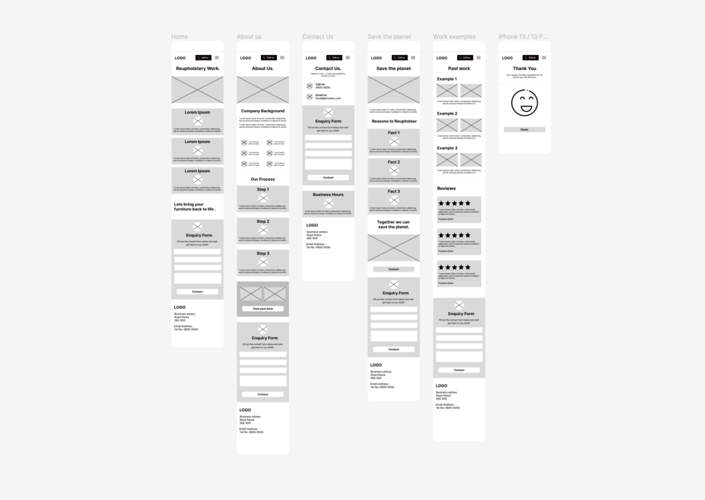
Responsive Wireframe Variations

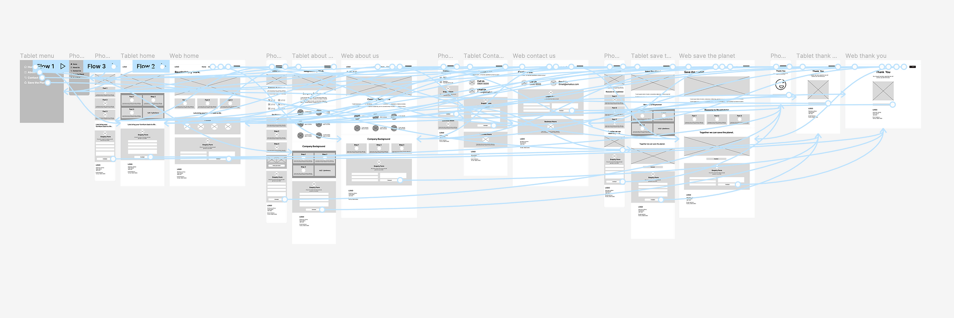
Low Fidel Digital Prototype
To create a low-fidelity prototype, I connected all the screens involved in the primary user flow. This enabled me to create a real flow of screens to be used for basic user testing. It was essential to test at this stage to ensure the information architecture had been placed correctly and, if not reorganised, to ensure users could navigate and achieve goals.
Usability study: Parameters
- Study type: Moderated usability study
- Location: United Kingdom, in person
- Participants: 5 participants
- Duration: 10 minutes
Usability study: Findings
- Users wanted an easy, simple process to finish inquiries. The fewer steps in the flow the better.
- Users wanted to be able to find contact details easily.
- Users wanted to view actual work items and disliked cramped sections.
Usability study: Changes
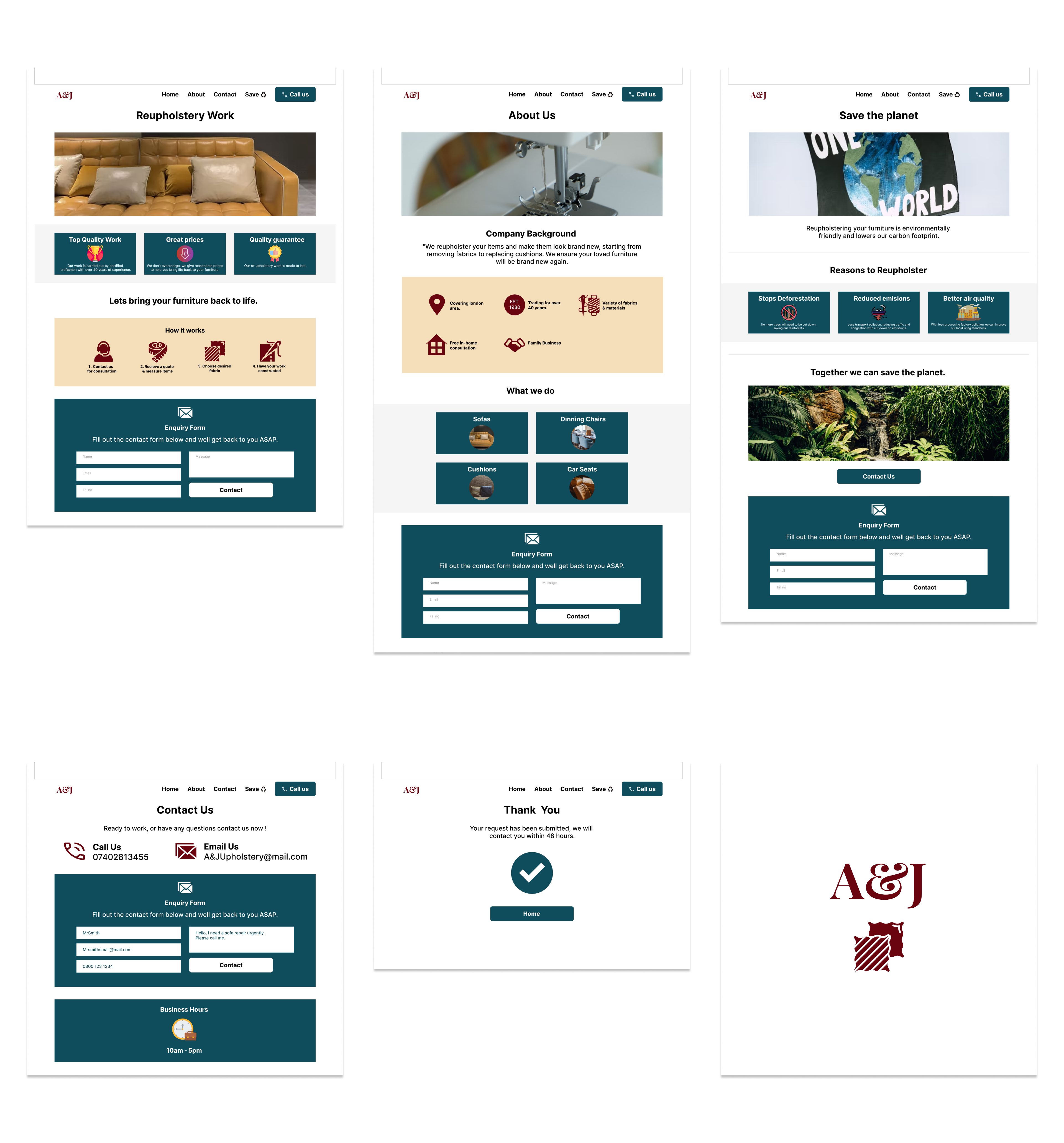
Based on the insights from the usability study, I made changes to improve the site by adding imagery and increasing spacing to separate segments better. Users found the call us button useful as they wanted the ability to contact the business quickly, this gave them the ability of doing so within seconds of opening the website.
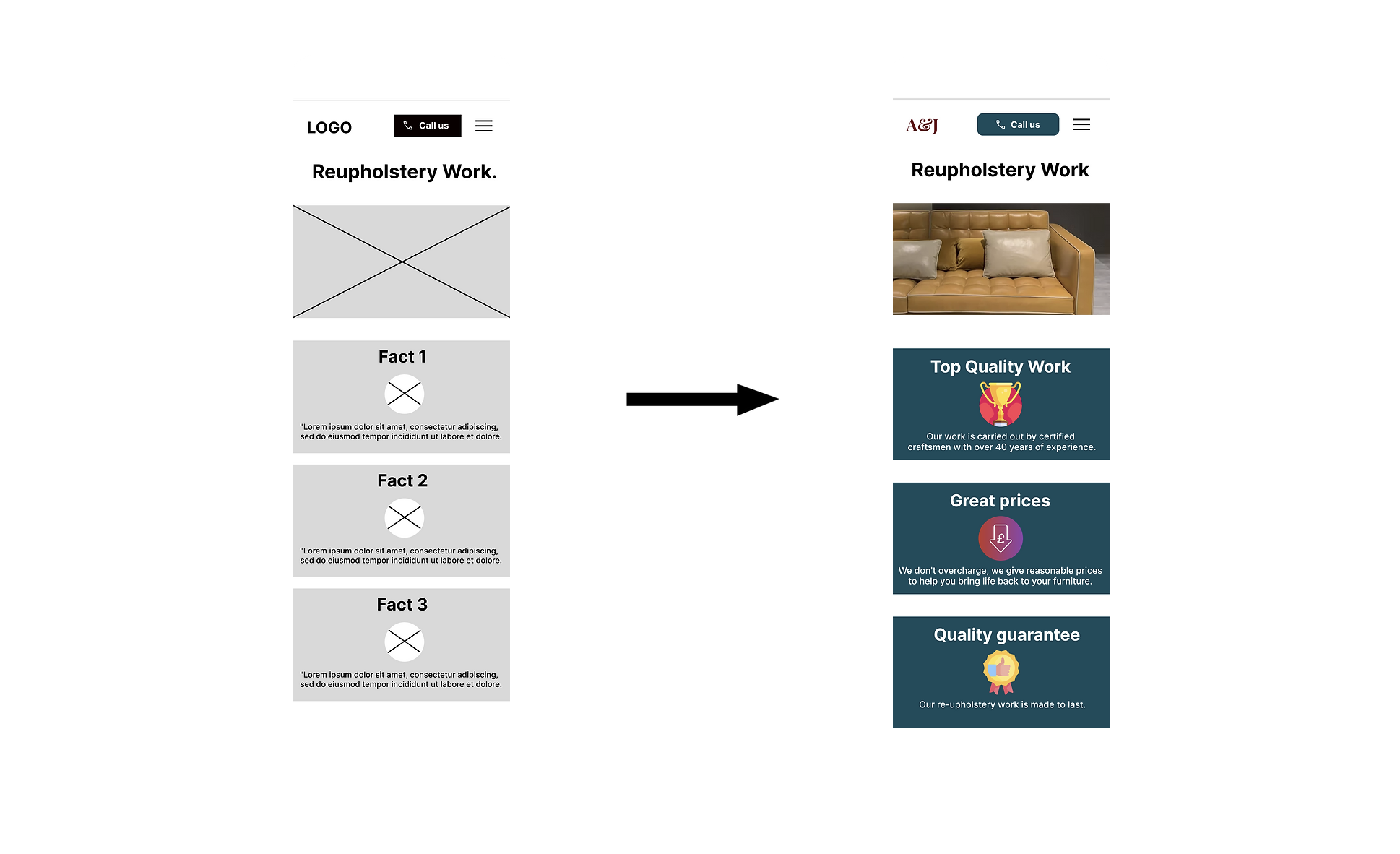
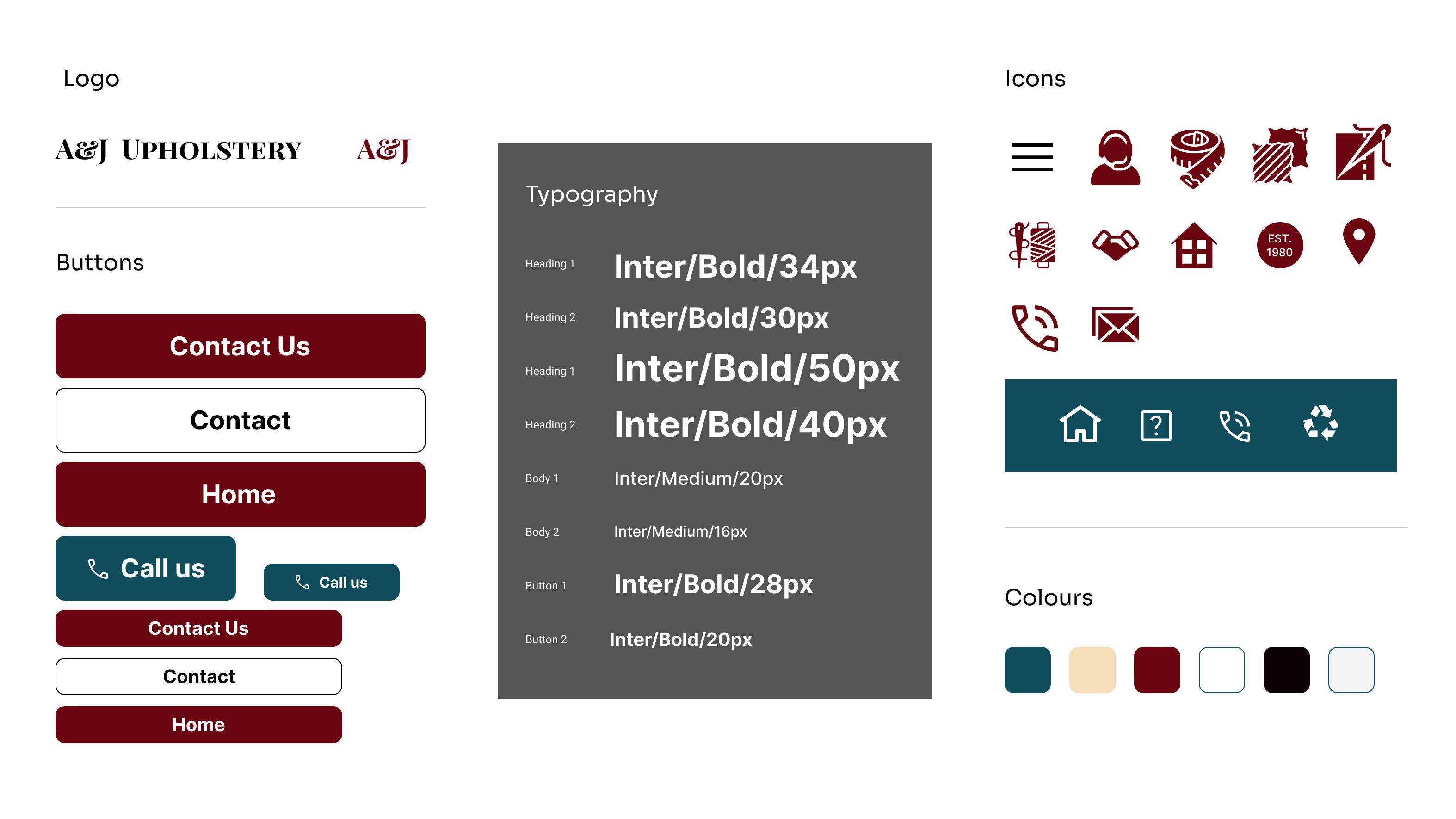
Design system UI Kit
High Fidelity Screens
I made changes to improve the site’s navigation, including design changes made after the usability study. The correct imagery and brand colours were needed at this stage to give a more realistic look and feel by creating a interface as close as possible to the final product demonstrating the site’s functions.
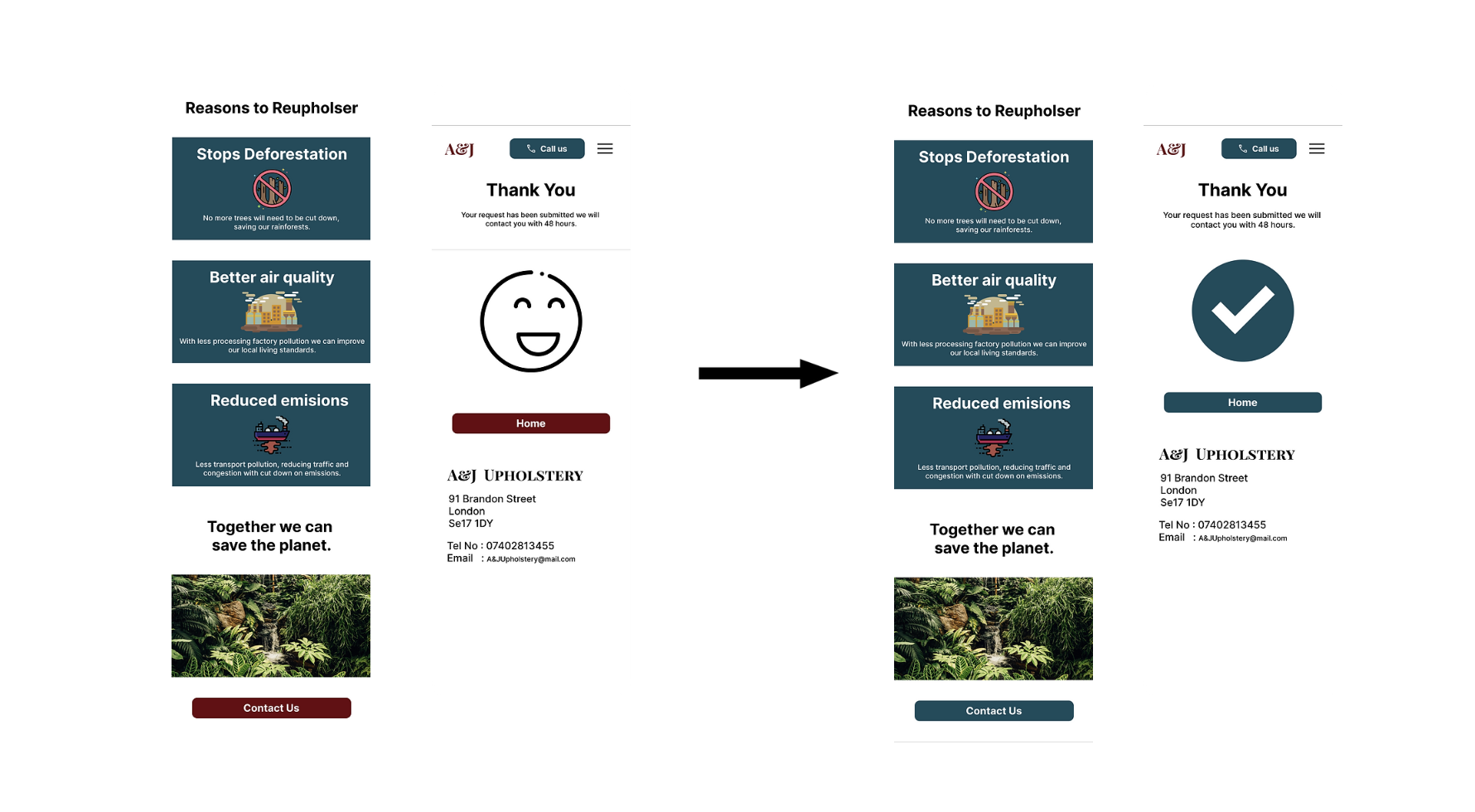
Responsive Variations

Usability study: Changes
Based on the insights from the high fidelity usability study, I made changes to improve the site by changing button colours and adding better imagery for inquiry confirmations. Initially, action buttons were the same colour as the brand’s logo “red”, but users found this confusing, and it was changed to green for positive reinforcement. Additionally, users wanted to have visual examples of previous work which would be added once the business owners collect new client photography shots of the full work process.
High-fidelity Prototype

Prototype Video
Accessibility Considerations
- I used headings with different sized text for clear visual hierarchy.
- I used landmarks to help users navigate the site, including users who rely on assistive technologies.
- I designed the site with alt text available on each page for smooth screen reader access.
Takeaways
Impact: Our client shared that they loved the look of the responsive website and how they feel it will increase their business conversions and raise the perception of their brand.
What I learnt: Doing freelance work can be challenging and a more tricky hands-on approach compared to other work systems. This can become apparent when clients are unsure about essential features. At difficult points of the process, it is important to refer back to business goals and best UX practices to show stakeholders what is needed for the project’s success.
Next steps would be to conduct more usability testing to identify areas that need improvement and ideate ideas for new useful features. Also adding real customer reviews and an in-depth image gallery when clients have built up a portfolio.