Project Overview
Homify is a home rental service that enables renters to accurately search and book homes to stay in. Current property rental sites often have misleading pictures, inaccurate availability and overcomplicated booking processes. Homify aims to fix the problem by creating a more reliable service that puts renters’ minds at ease during the search and booking process.
A&J Upholstery Responsive Website
My role
UI/UX Designer, Research, Wireframes, Prototypes, User testing. Tools used: Adobe .
The Problem
The Problem
Online rental sites having confusing, misleading and inefficient systems for contacting agents in renting processes.
Solution / Project Summary
Homify is a home rental website that offers users options in their rental process. The typical users are working professionals of all ages renting for work or leisure. The goal is to make renting easy and fast for all users.
Design process

Understanding The User
To help understand the average frustrations of home renters, identifying who these users are, figuring out what their needs and motivations were to find pain points, I used the following methods; Interviews, Surveys, Personas, Problem statements and User journey maps were used to emphasise the housing rental problem.
User Research: Pain points
- Rental website designs are often congested with unnecessary information, which results in confusing navigation and reduced completion rates.
- Lack of confirmation will lead customers to be confused about whether their requests have been sent and received.
- Unclear filtering will stop users from organising results based on their constraints.
User Research: Summary
I discovered many home rental websites are overwhelming and confusing to navigate, they often fail to update availability, which frustrates many target users. This causes a normally enjoyable experience to become challenging for them, and they feel as if they are running in circles.
I also discovered that many target users are excited about booking a property, whether it is for work or leisure reasons. However, users wanted a transparent and efficient booking process which enables them to feel confident in their purchase. Misleading and confusing adds will have users not wanting to reuse sites due to scams in quality and lack of advertised amnesties.
Personas and Empathy Maps
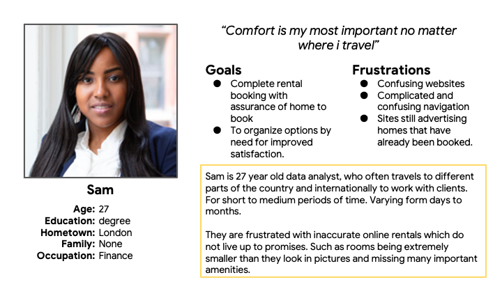
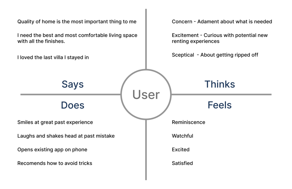
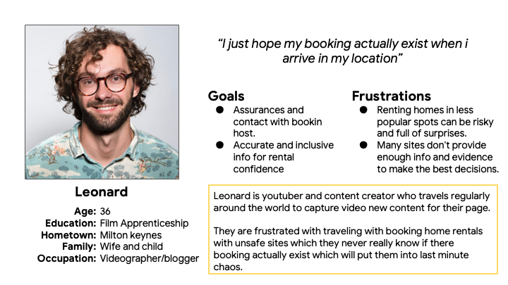
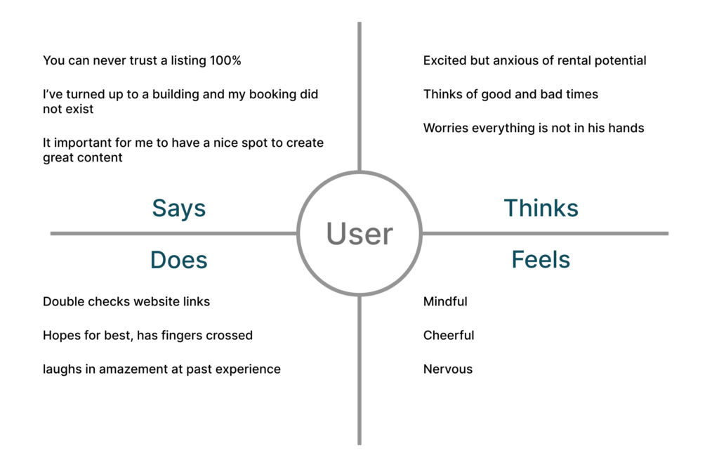
Using research and understanding paint points enabled me to create personas focused on the target users. Referencing these throughout my design process enabled me to tackle the main problems needing to be solved and create solutions with users at the heart of decisions and considerations.
Persona
Empathy Map
Persona
Empathy Map
Ideate
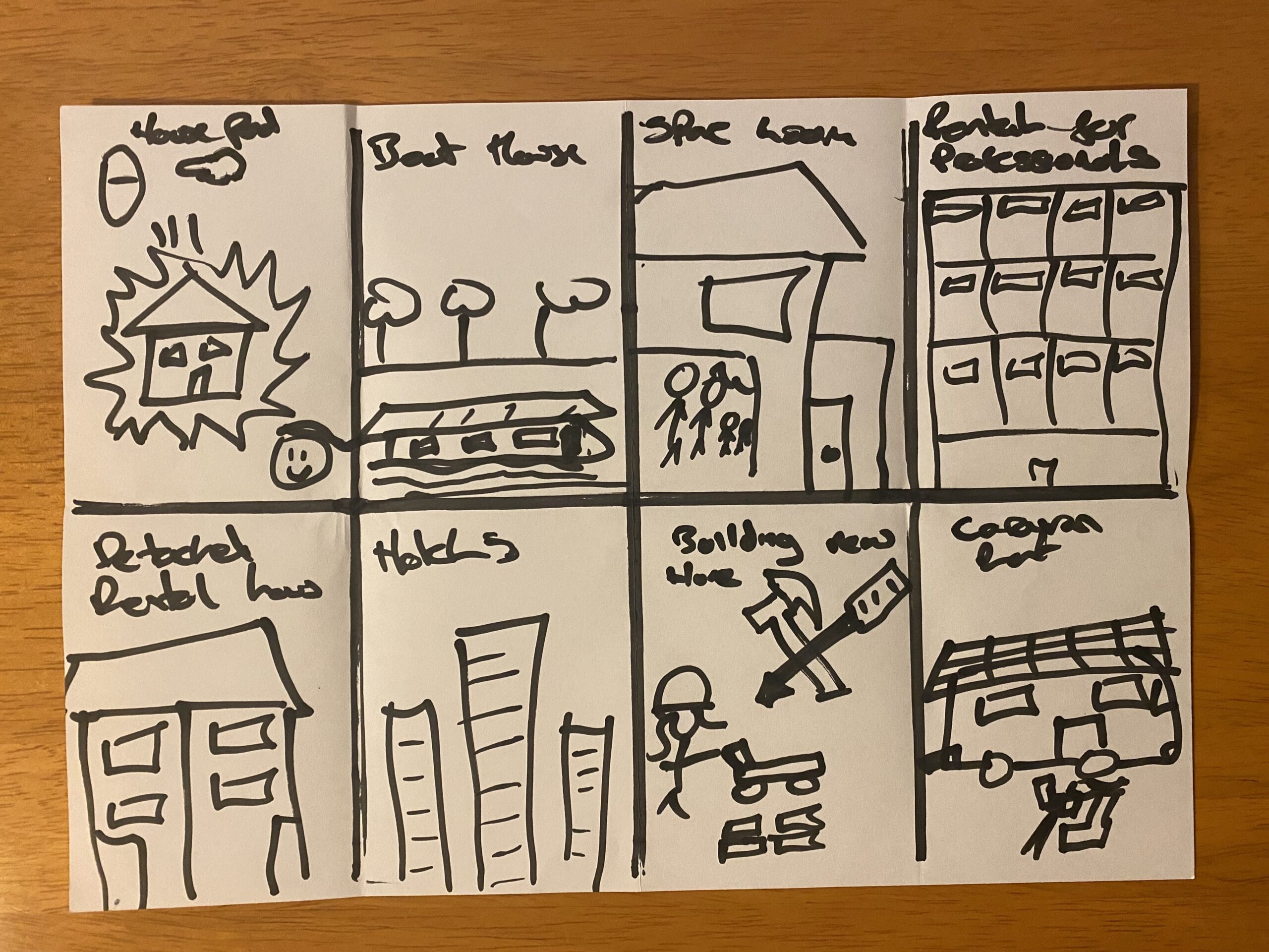
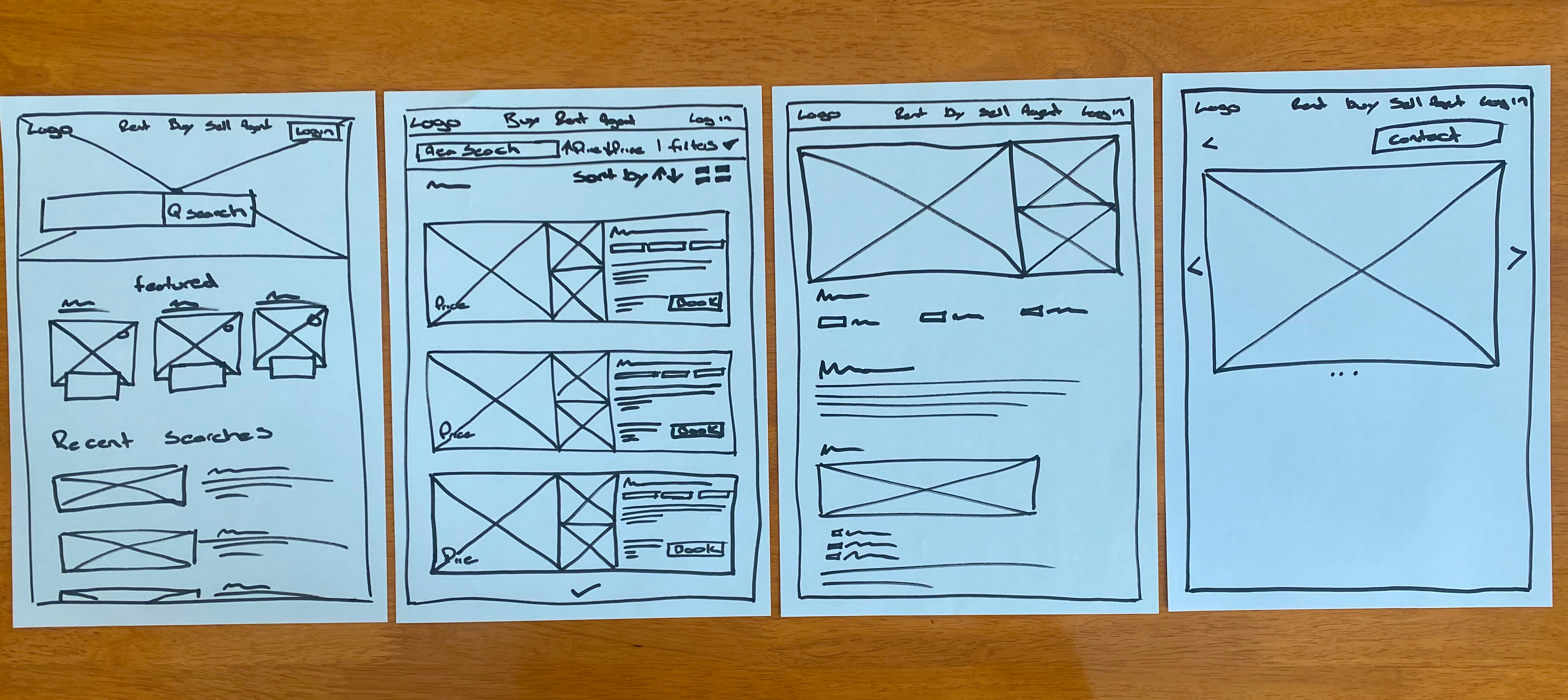
I used crazy eights, sitemaps & paper wireframes to brainstorm ideas. This enabled me to create 4 multiple screens of each page and choose the essential features needed to be incorporated into potential layouts and final wireframes.
Difficulties with website navigation and accurate filtering were major pain points for users. Based on this, I created information architecture decisions that would improve the overall website navigation and accuracy of availability for users.

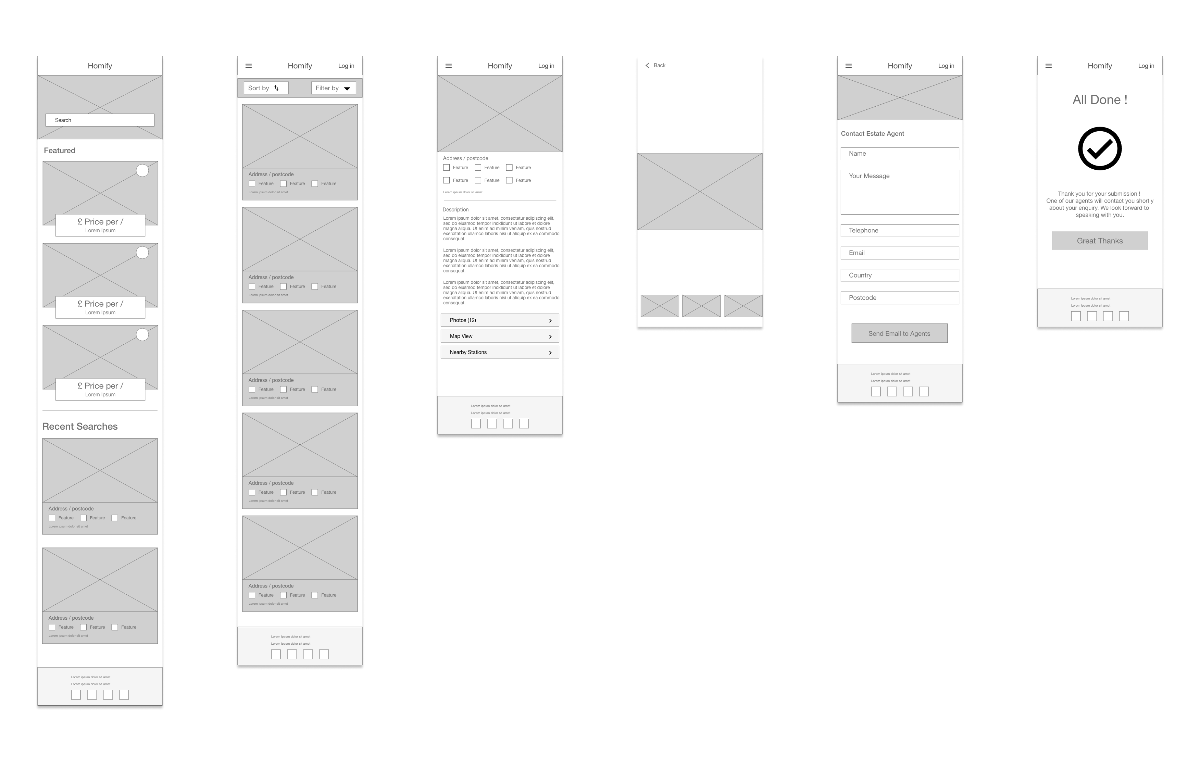
Digital Wireframes
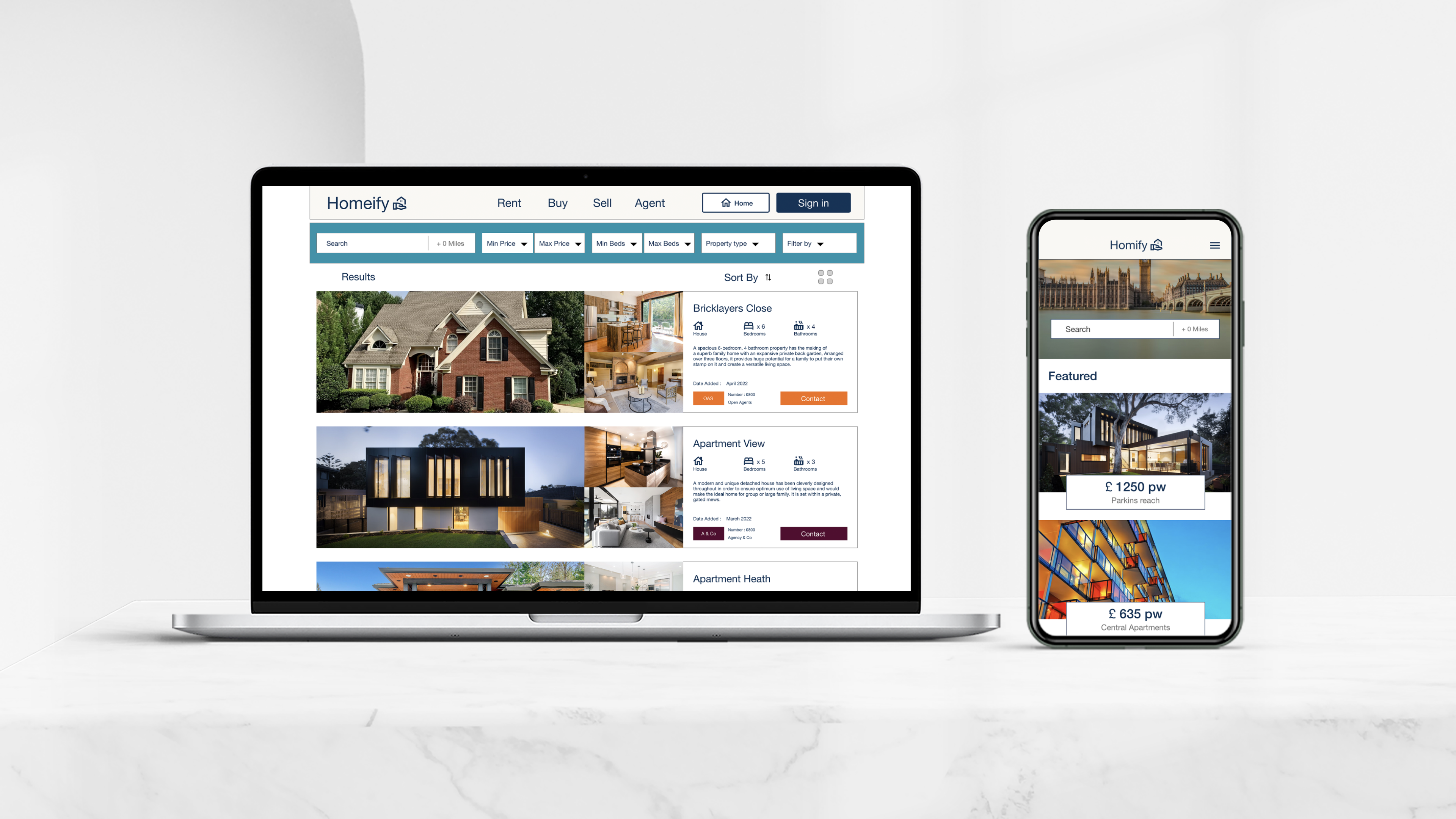
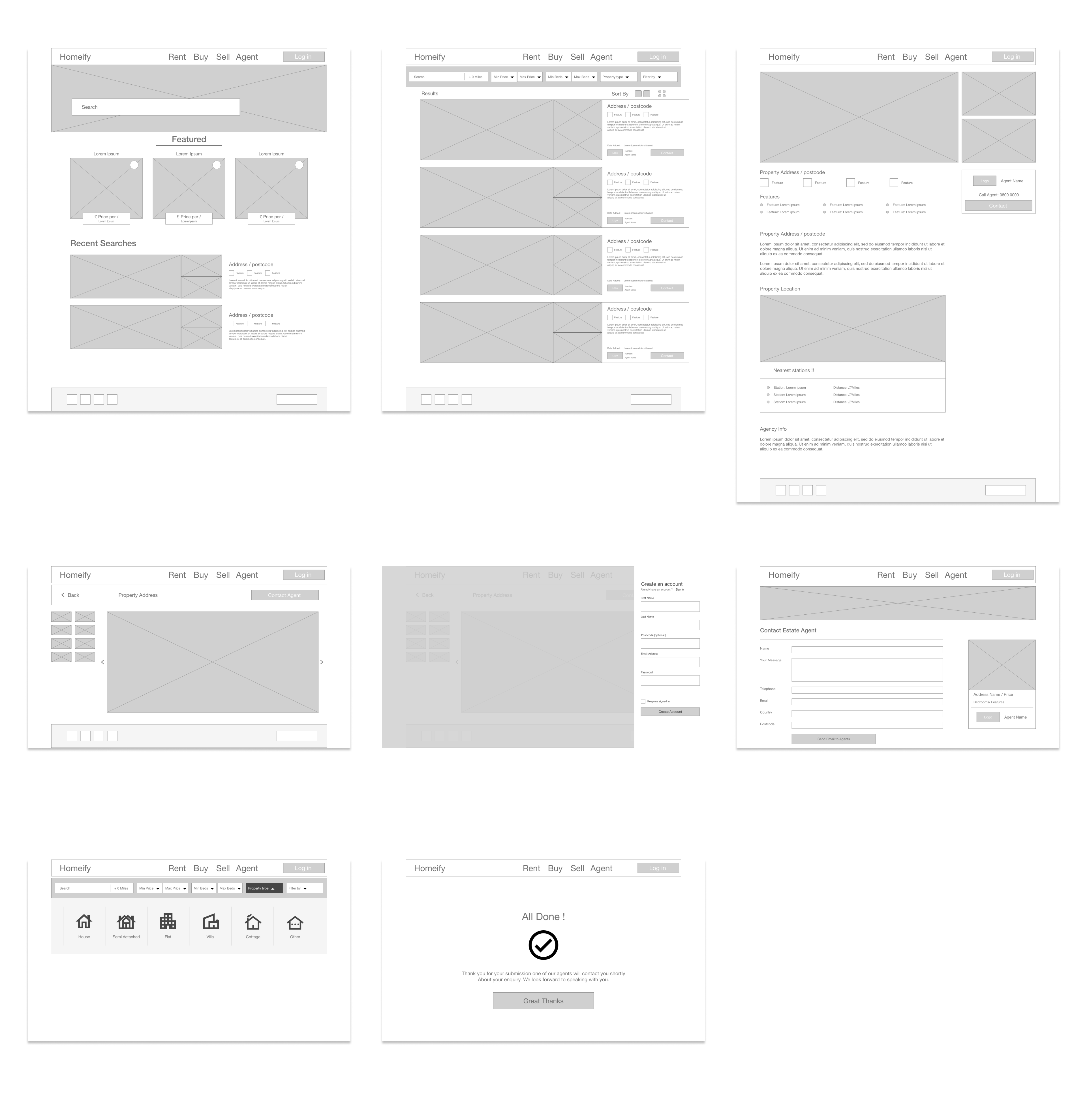
Moving from paper to digital wireframes made it easy to understand how the design could help address user pain points and improve the user experience. A useful and easy to use filtering bar on the home page was a key part of my strategy. It was also helpful to be able quickly rearrange features to see whether alternative features would work together.
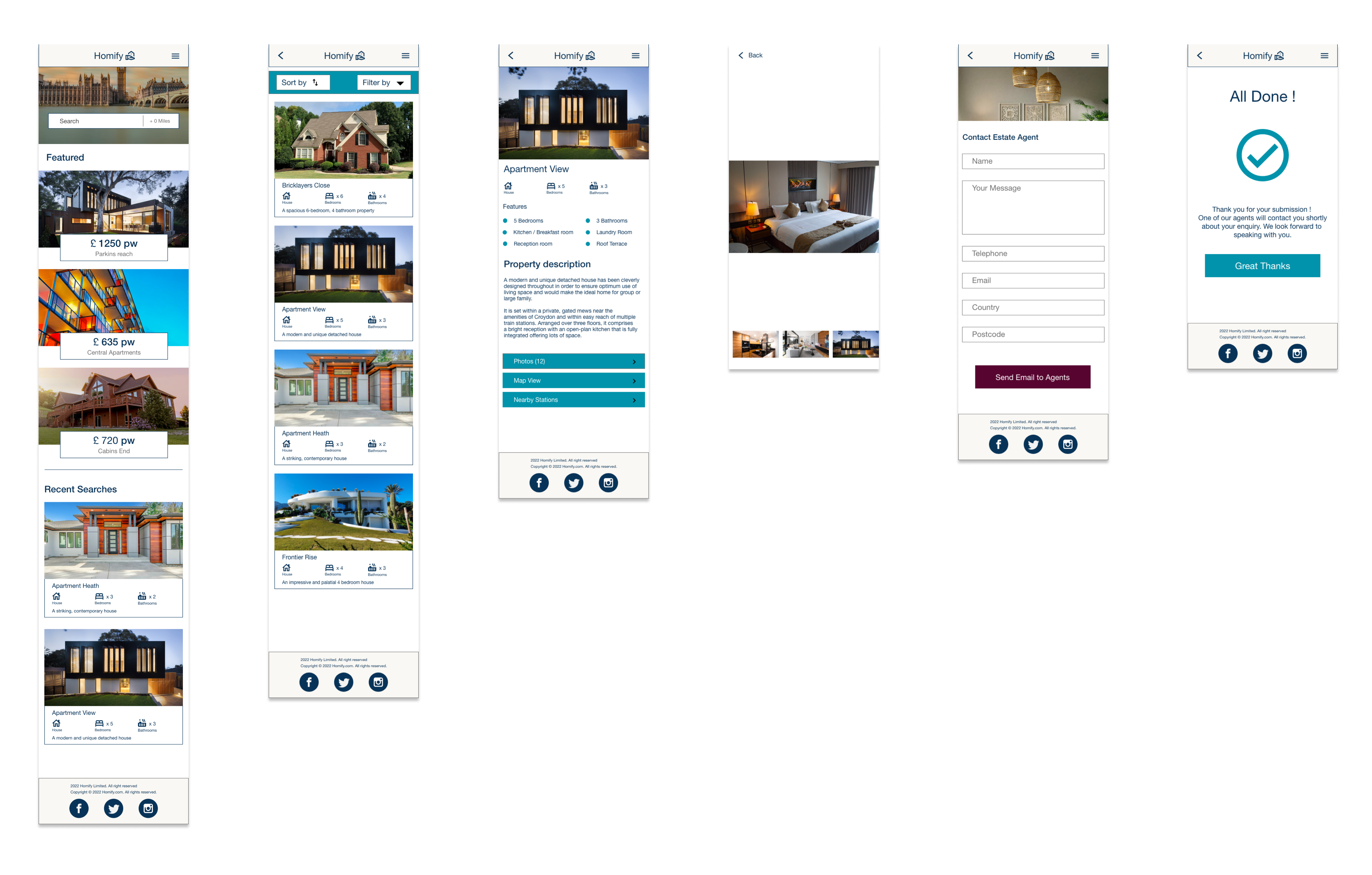
Mobile Wireframe Variations
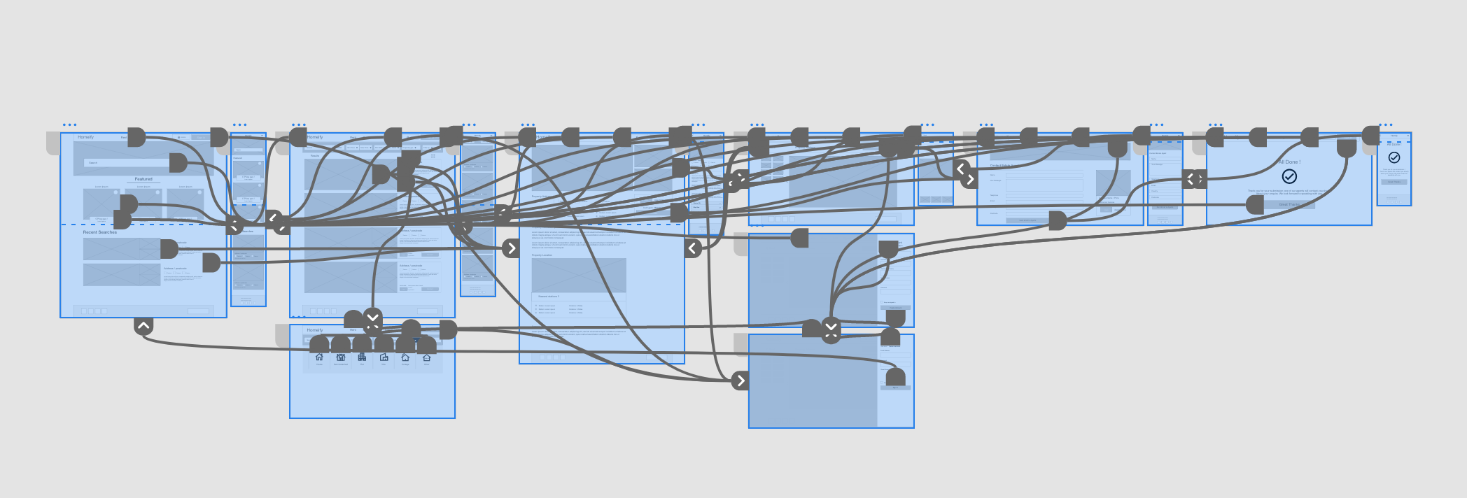
Mid Fidelity Prototype
Usability Study: Parameters
- Study type: Moderated usability study
- Location: United kingdom, in person
- Participants: 5 participants
- Length: 10 minutes
Usability Study: Findings
- Home: Some users weren’t aware the logo could be used as a home button, and got stuck during navigation.
- Confirmation: Users wanted proof their enquiry had been sent.
- Account: Users wanted to save previous history for recollection.
Usability study: Changes
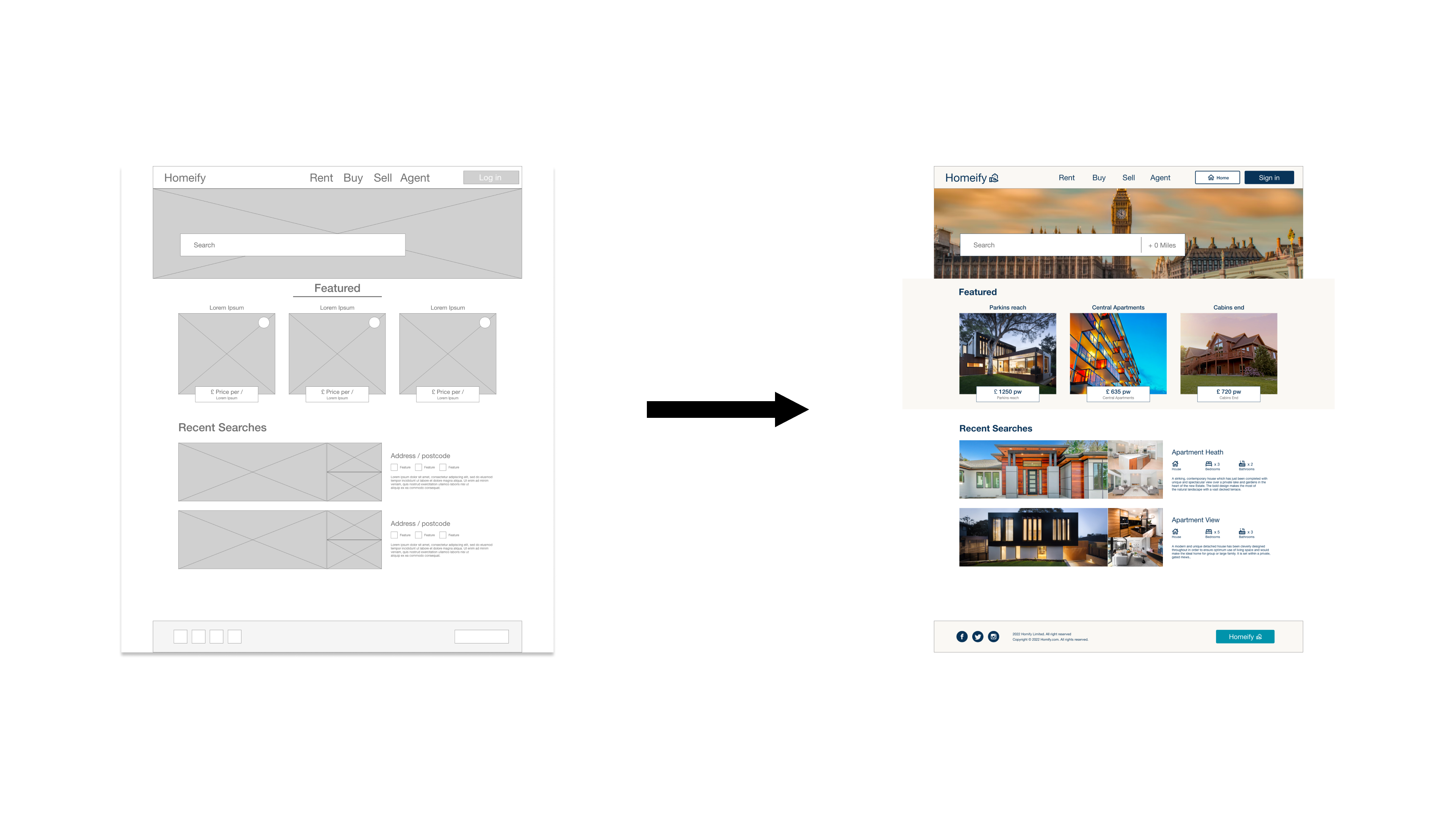
Based on the insights from the usability study, I made changes to improve the site’s navigation by adding an actual home button next to the sign in button. Enabling a quicker reset process.
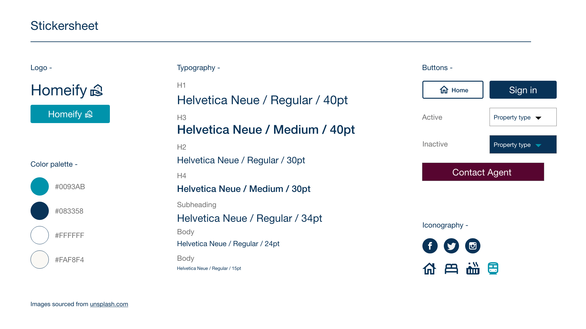
Design system UI Kit
High Fidelity Screens
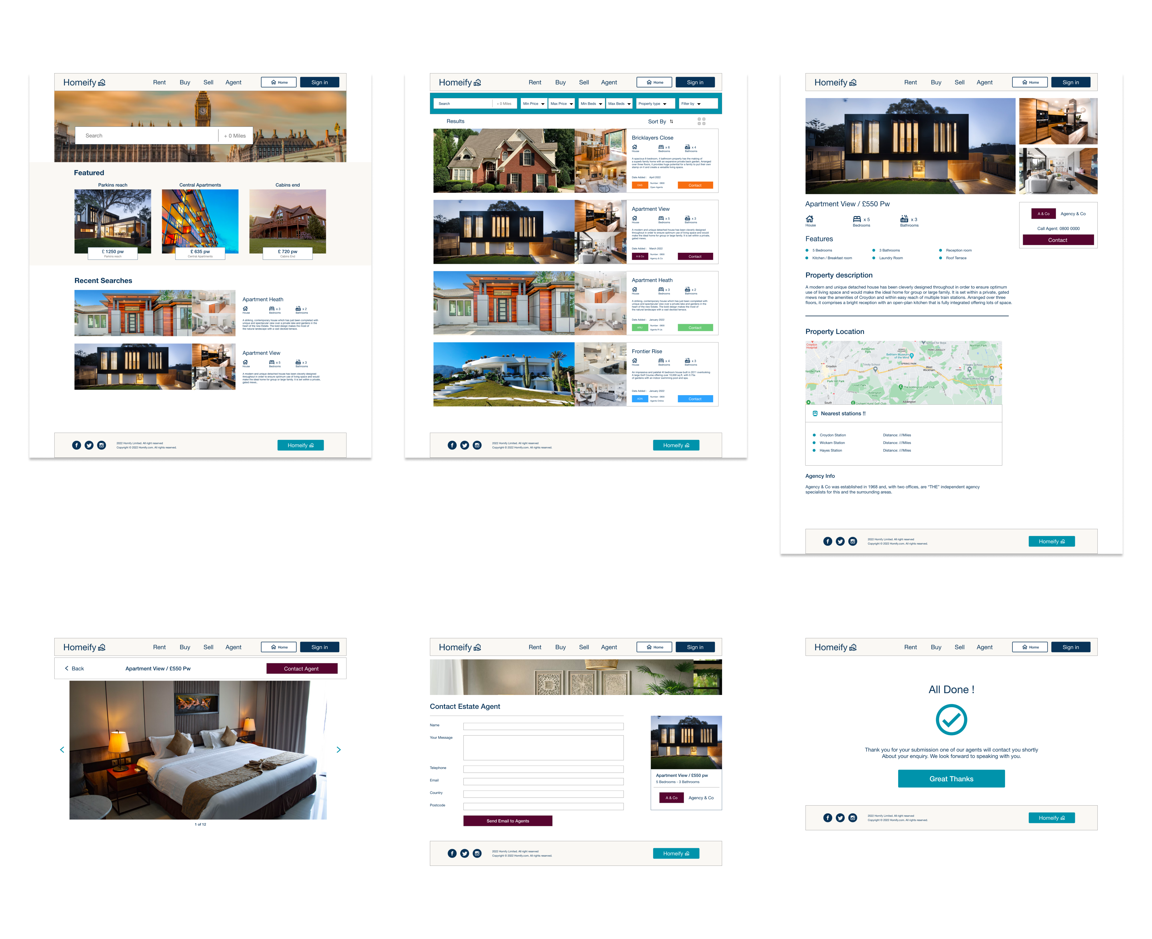
Moving on to high fidelity screens enabled me to iterate on the design and carry out another round of user testing which helped refine the product further. Changes such as adding real photos and creating visual real estate helped users to picture a more finalised product and helped them feel as if they were using a live product.
Mobile Variations
High-fidelity prototype

Prototype Video
Accessibility Considerations
- I used headings with different sized text for clear visual hierarchy.
- I used landmarks to help users navigate the site, including users who rely on assistive technologies.
- I designed the site with ALT text available on each page for smooth screen reader access.
Takeaways
Impact: Our target users shared that the design was intuitive to navigate through, more engaging with the images, and demonstrated a clear visual hierarchy.
What I learnt: A single feature can make or break a user’s experience. The most important takeaway is to focus on the users’ needs when coming up with design solutions.
Next steps would be to conduct more usability testing to identify areas that need improvement and ideate ideas for new useful features.