Project Overview
London Underground, aka the Tube, is an underground transport network operating 272 different stations, transporting up to 5 million people per day with up to 543 trains running at peak times. It is often impacted by delays and signal failures, causing duress to thousands of customers simultaneously. The redesign aims to make the system more accessible and reliable, enabling travellers to adapt to disruptions more effectively and navigate the busy and complex network with ease.
London Underground Redesign Unsolicited
My role
UI/UX Designer, Research, Analysis, Wireframes, Prototypes, User testing. Tools used: Figma.
The Problem
The Problem
Everyday travellers are impacted by delays and signal failures, causing duress to thousands of customers simultaneously. There is a lack of visibility, accessibility and capacity to cater for travellers and those who have visual and mobility impairments when failures occur.
Solution / Project Summary
To improve the current London Underground products & create a more versatile travel experience which will enable travellers to adapt to regular uncertainty, disruptions & efficiently plan fast journeys.
Design process
Understanding The User
To gain a deep understanding of the problems users were facing in the underground, over 3 months I conducted in depth face to face user research, observing thousands of daily users as well as talking to and conducting open interviews with hundreds of users. I wanted to discover the priority needs of travellers, their biggest frustrations and the largest pain points which impacted their travelling experiences.
- Open ended User Interviews
- Field Observations
- Customer Feedback Reports
- Usability Testing
User Research: Pain Points
- No connection in the underground, so users are unable to plan their journey once they have already entered the underground.
- Train cancellations and delays, customers panicking and running into stations trying to get on trains, but service is shut off with no alternatives.
- Signage & update boards giving incorrect info due to service interruptions confusing customers.
- Customers with impairments are frustrated by getting held up waiting for station assistance.
- Poor physical signage confuses customers and causes them to travel in the wrong directions.
- Customers are confused about touching in and out when changing on interlink lines.
- Customers buy tickets for incorrect zones because they do not understand travel rules properly. I.e. they bought 2-3 when they needed 1-3.
User Research: Summary
After talking to over a hundred travellers, observing over 50 customers using the TFL website, TFL Go app and ticket machines, carrying out tasks such as planning journeys, looking for alternative routes as well as planning how to receive station assistance. I got to see first hand how travellers interacted with the primary underground planning provider, the TFL go app.
I identified which alternative services were frequently used and what benefits they have, and was able to watch their frustrations during use, identifying shortfalls of each service provider. This enabled me to spot opportunities for improvement and a chance to improve the London Underground experience by providing solutions to their pain points.
I discovered users need to be able to plan journeys without a network connection. Users need more autonomy on routes and want to decide on which line to take with accurate journey times. Users need better app onboarding and need to be able to check why delayed services are not matching up with service board timers, enabling them to make more informed decisions. Furthermore, better communication between travellers with impairments and special needs to London Underground workers enables proper preparations.
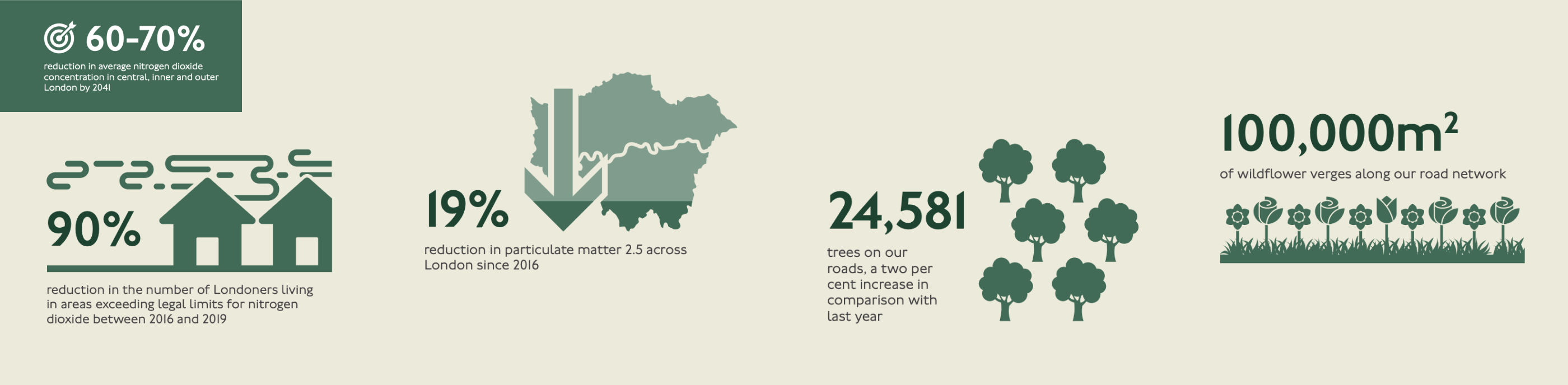
Understanding Business Needs
London Underground and TFL’s business goals aim to increase the efficiency and productivity of the network. As London’s population and economy grow, transport services must improve, ensuring safety and reliability. The aim is to grow passenger demand, creating greater revenues and financial sustainability which can be used to reinvest in further expansion and maintenance of the network as well as reducing emissions to mitigate the climate emergency and clean up London’s air.
Additionally, after consulting with a member of TFL’s technology team, I also learnt a major technology goal was to start integrating all TFL and London Underground services into one product. It was important for me to understand and integrate these technology and business goals as well as users’ needs in the ideation process and ensure they influenced the design solutions I came up with.
Competitive Analysis
I conducted a competitive analysis, analysing direct and indirect London Underground journey planners to discover what the apps were doing well, as well as identifying shortfalls which were contributing to travellers’ frustration. I compared a couple of the most important features needed for effective travel planning and noted unique features which could be drawn on later in the ideation process.

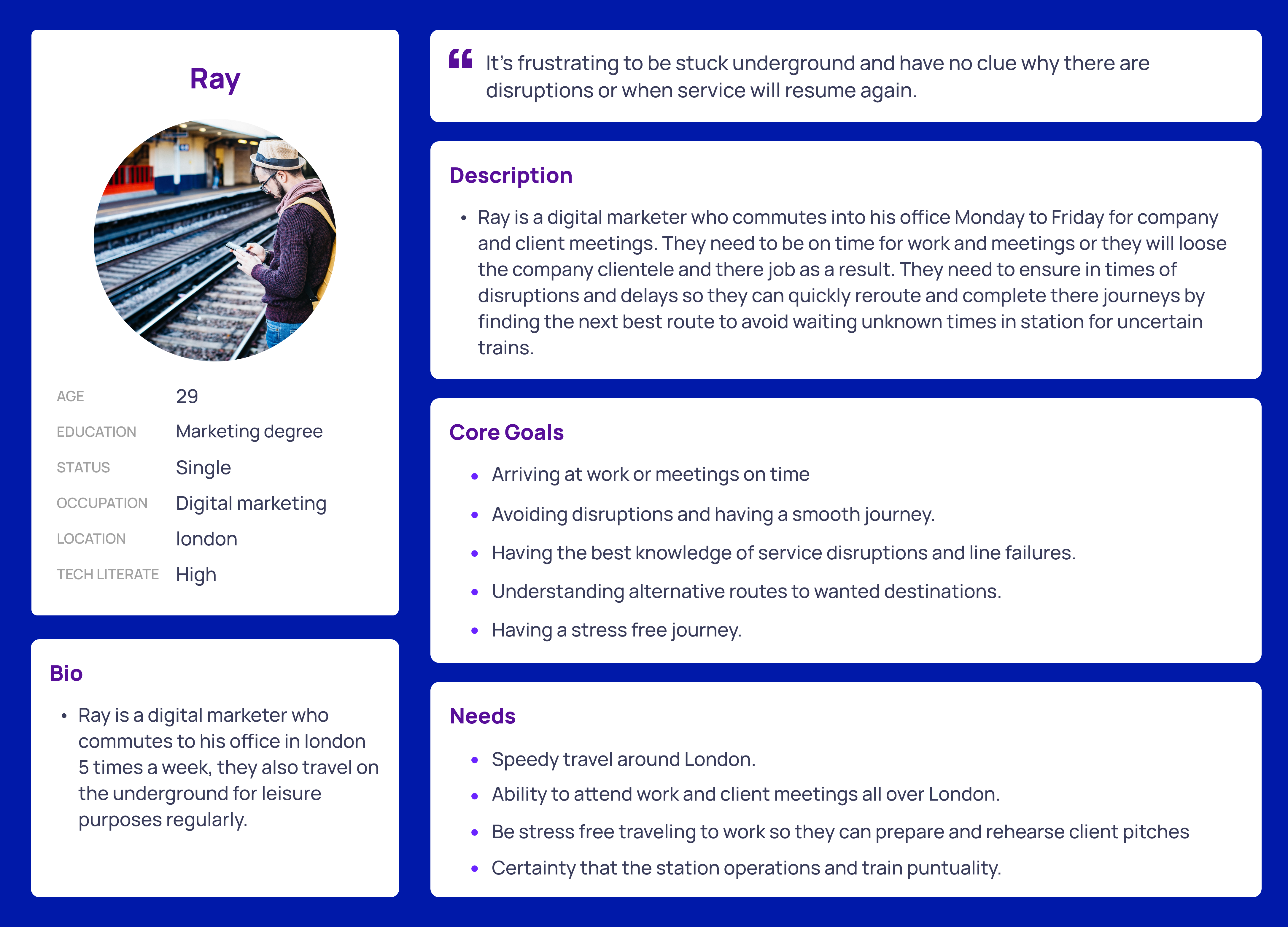
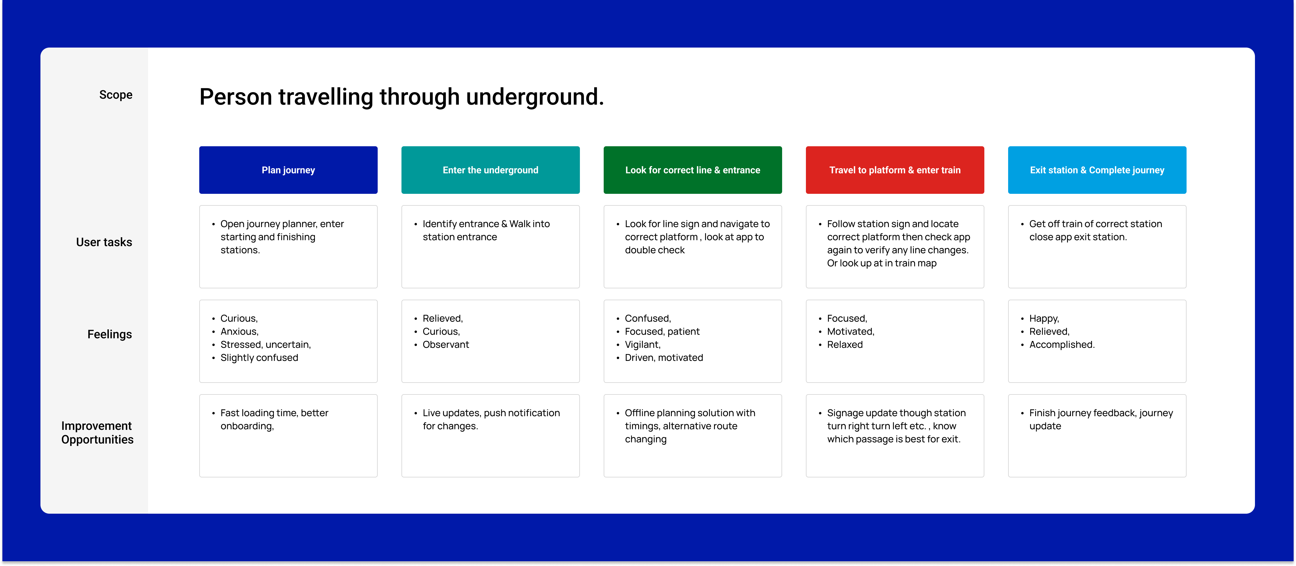
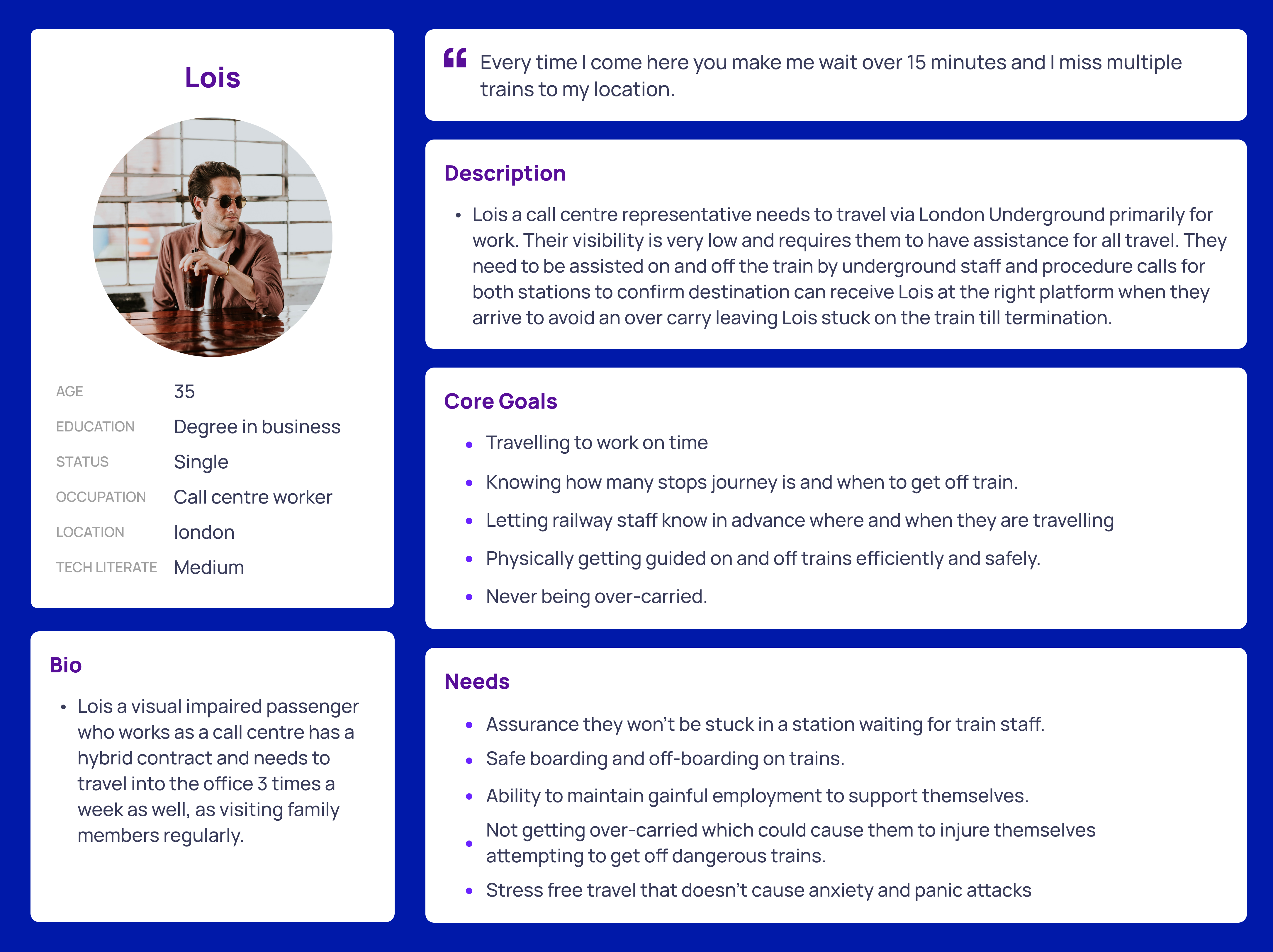
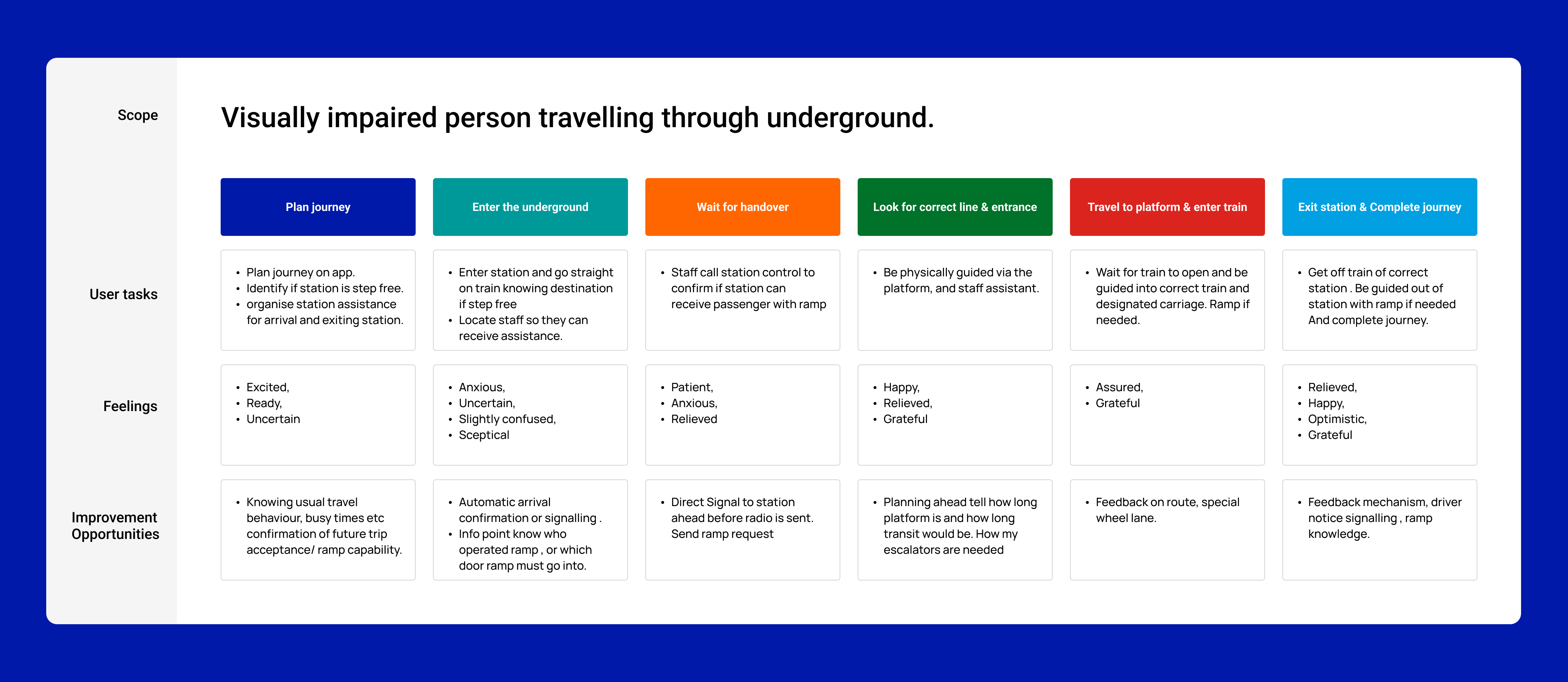
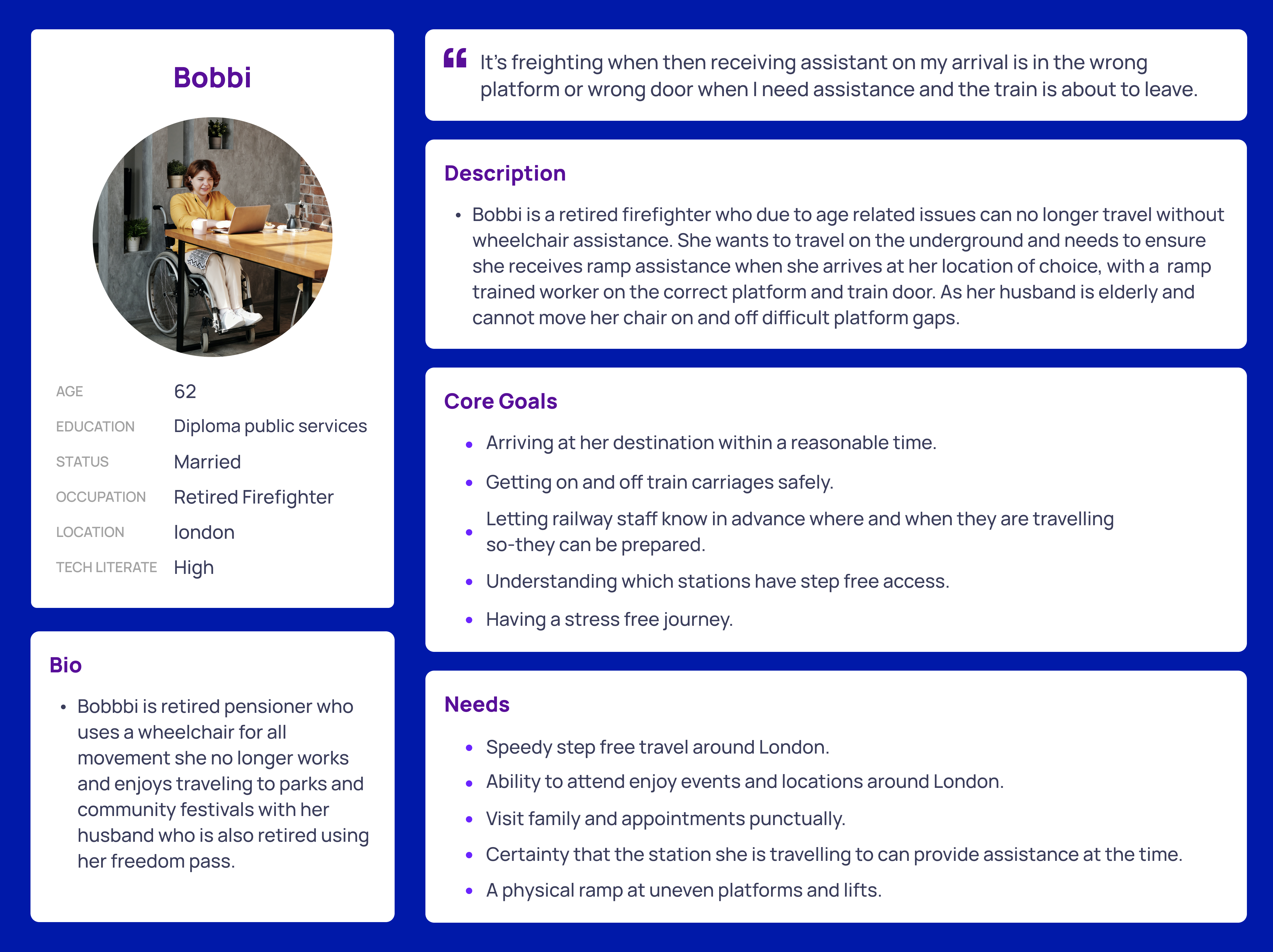
Personas and User Journeys
Using results gathered from user interviews enabled me to understand pain points and create personas focused on the typical user. This enabled me to stay on track during the design process to address needs and solve the users’ problems.

Problem Statement
After combining and understanding the needs of user goals and frustrations through research. I synthesised the data and formed a problem statement; I used this as a guide and reference point during the brainstorming and idea generating phase to aid with my app redesign.
“The London Underground traveller needs accessible and responsive travel solutions on the go due to regular disruptions, cancellations and service delays as they often find themselves stuck or travelling inefficiently once a problem starts due to poor connectivity options below ground”
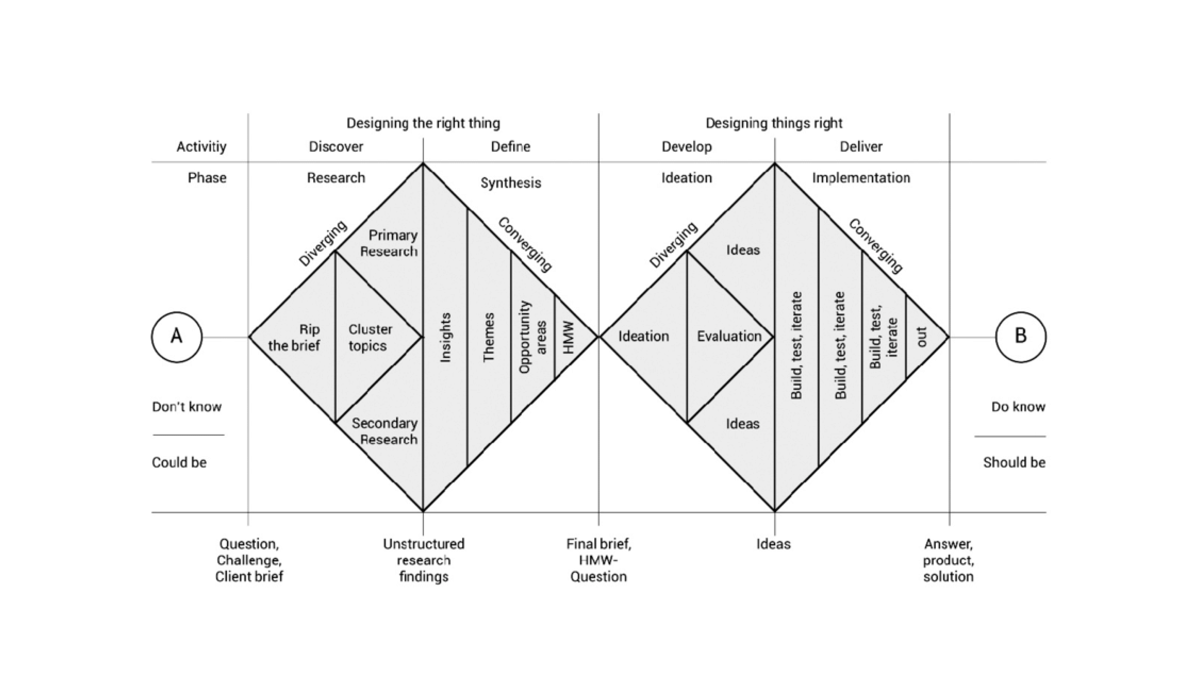
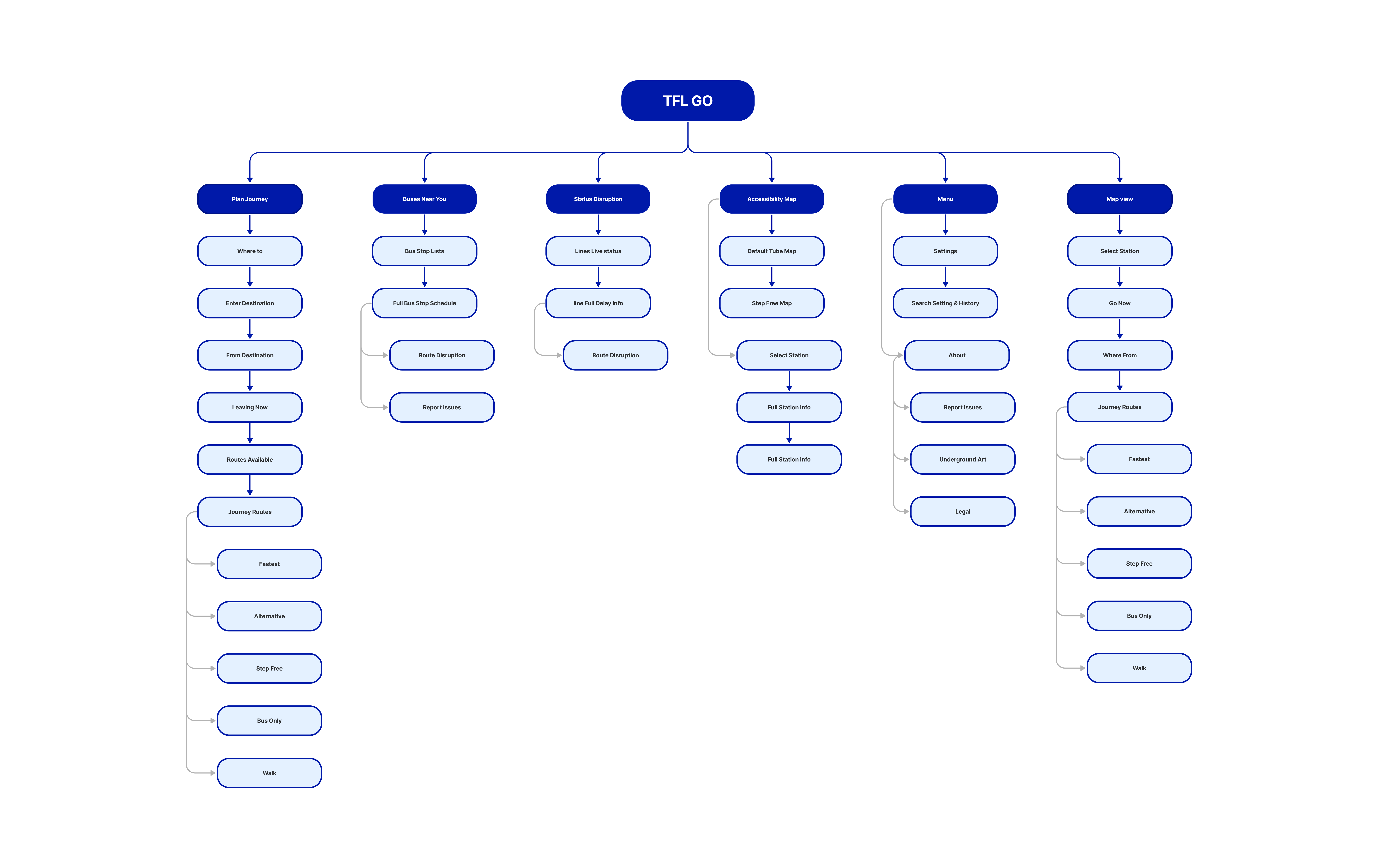
Information Architecture
To identify where the redesign would be most effective, I built out the information architecture to understand the structure and further see how users would navigate step by step through London Underground’s official journey planning app.
Synthesis: Key Opportunities
- Travellers need to be able to reroute their journey underground, where many have no internet connection, as delays and breakdowns can occur at any moment.
- Users need a way to instantly resolve incorrect travel charges, as these can cause panic and frustration, leading to travel disruptions due to insufficient balances. The current resolution process is too lengthy.
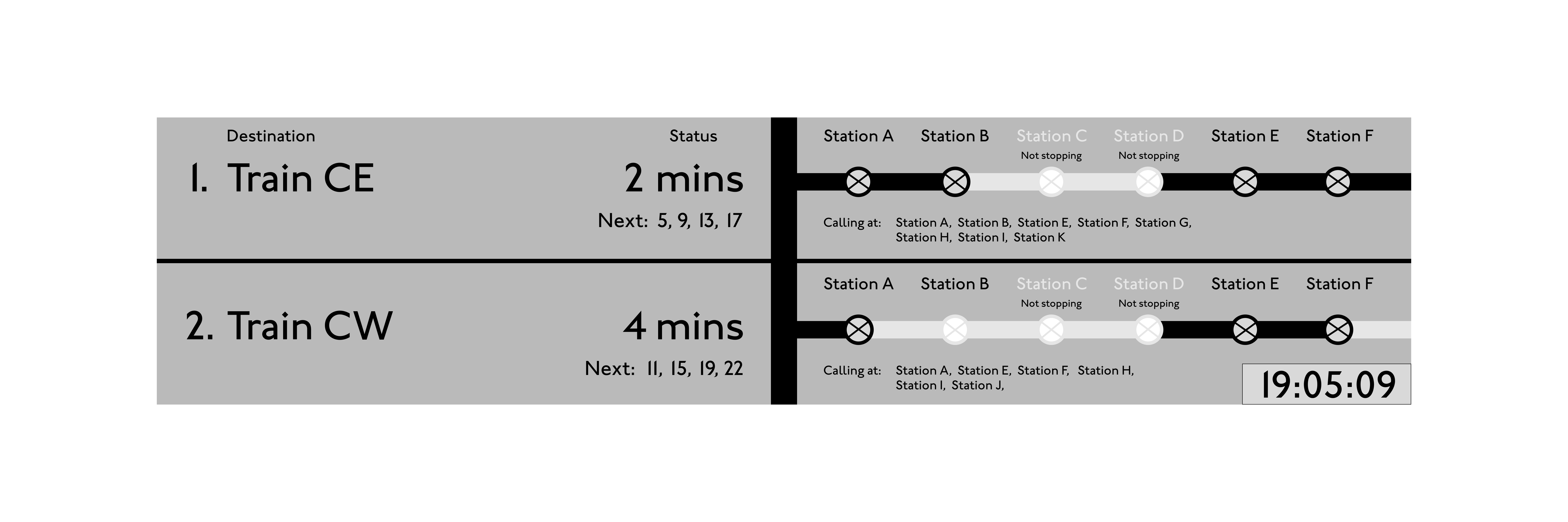
- Signage boards should be interactive and inform travellers that trains run frequently, just minutes apart, to prevent panic running and overcrowding on full trains.
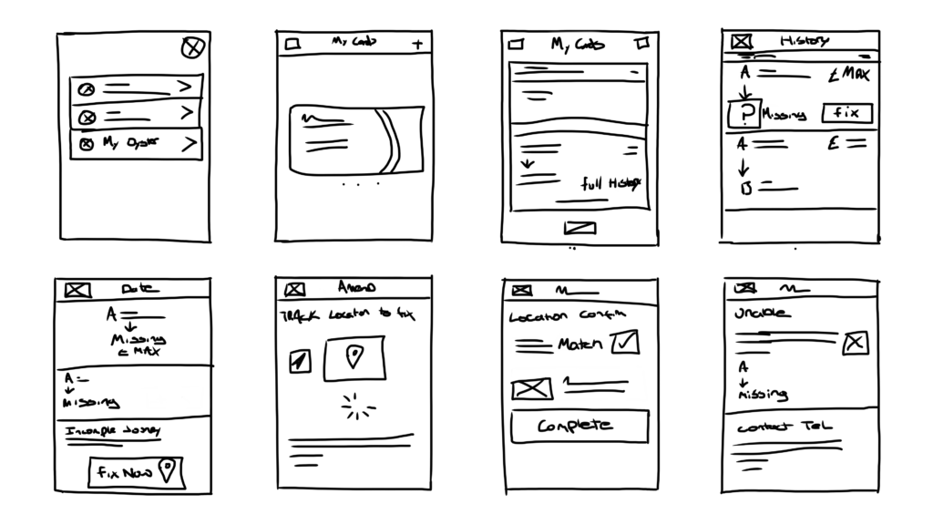
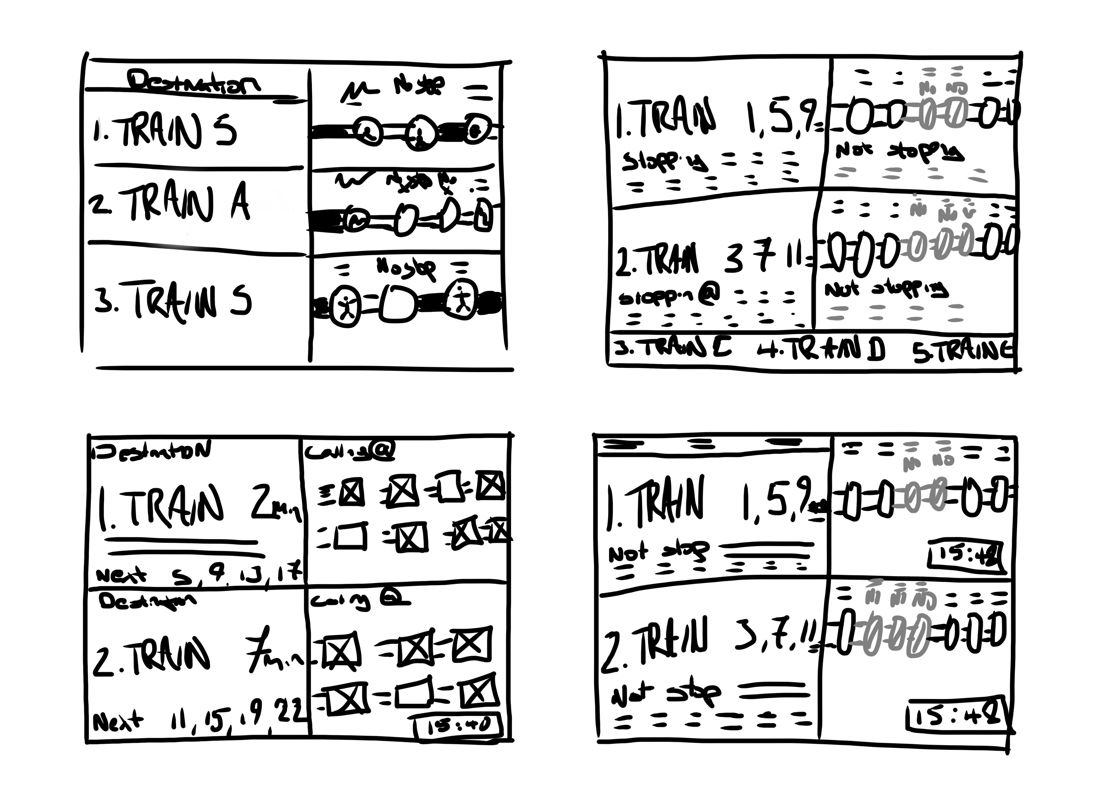
Paper Wireframes
I explored multiple design variations for the various digital screens using paper wireframes. I was able to reorganise features using feedback gathered to generate iterations that could be later incorporated into higher fidelity screens to provide a better experience and tackle travellers’ needs better.
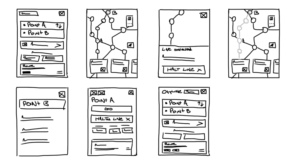
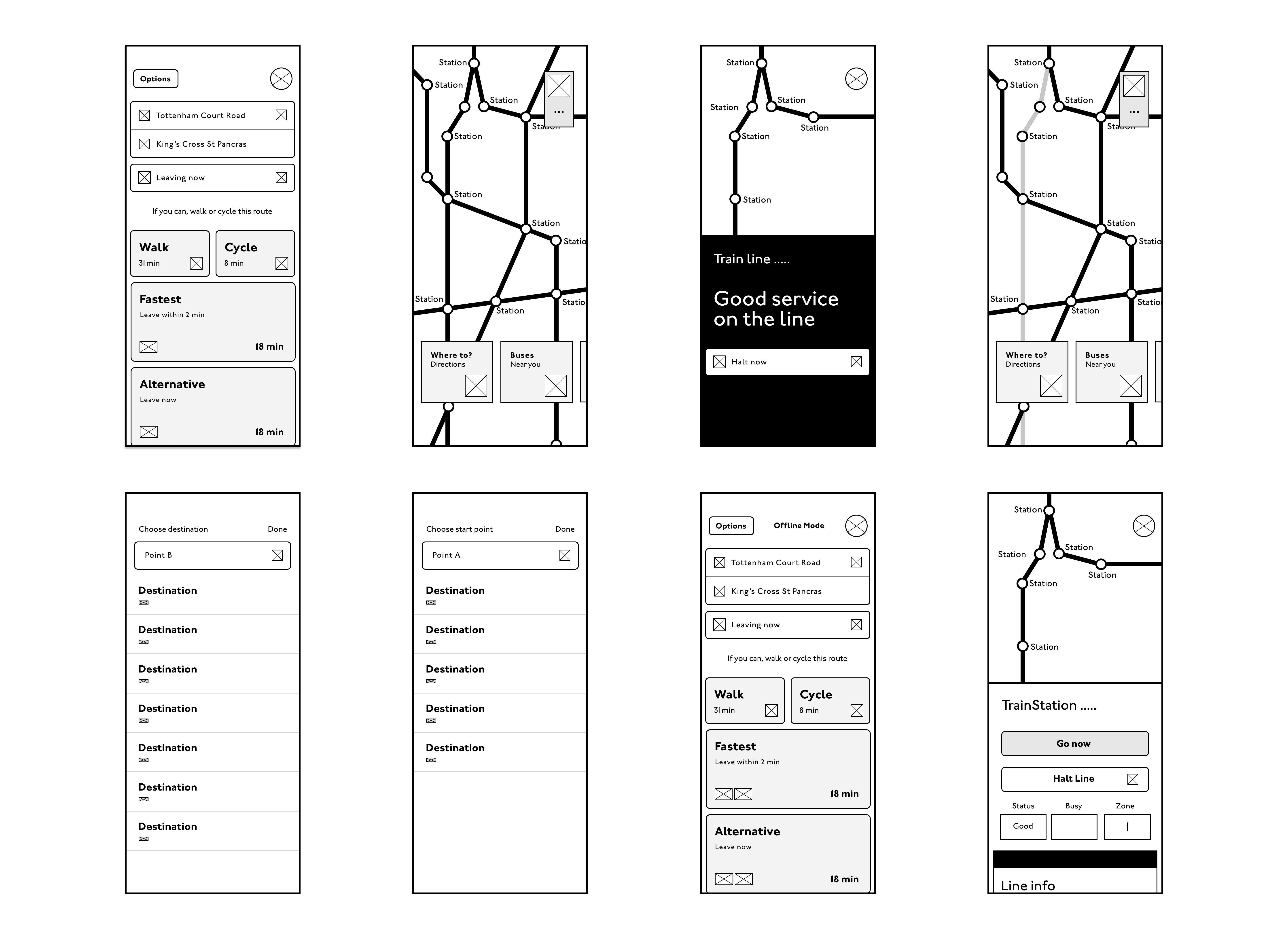
Mid Fidelity Wireframes
I then moved to mid fidelity wireframes so I could see how to implement suggested features into the existing flow and design system, aiming to identify key opportunities and experiment on a realistic model without spending too much time on a finished product with colours, icons and pictures.
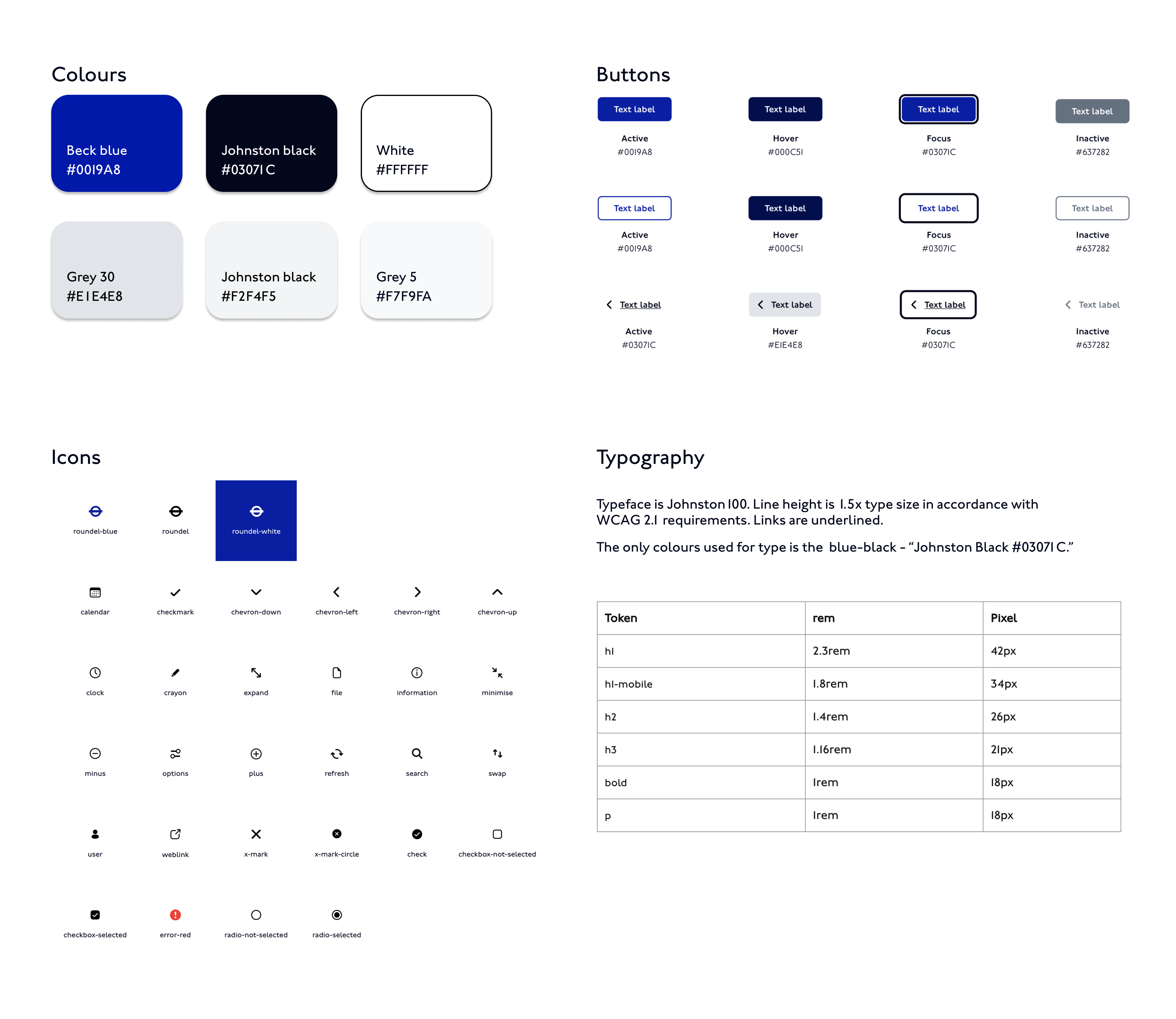
Design System UI Kit
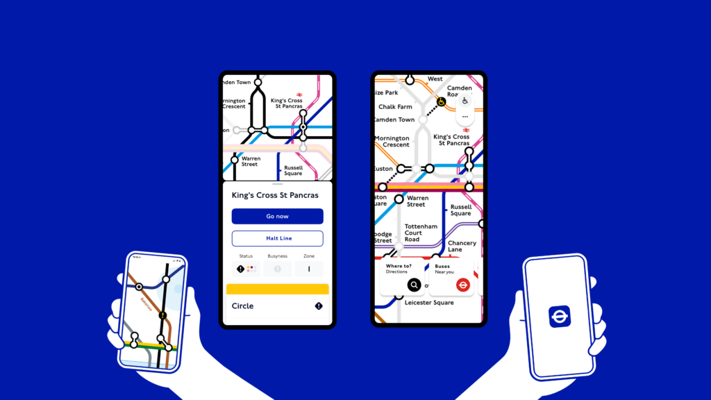
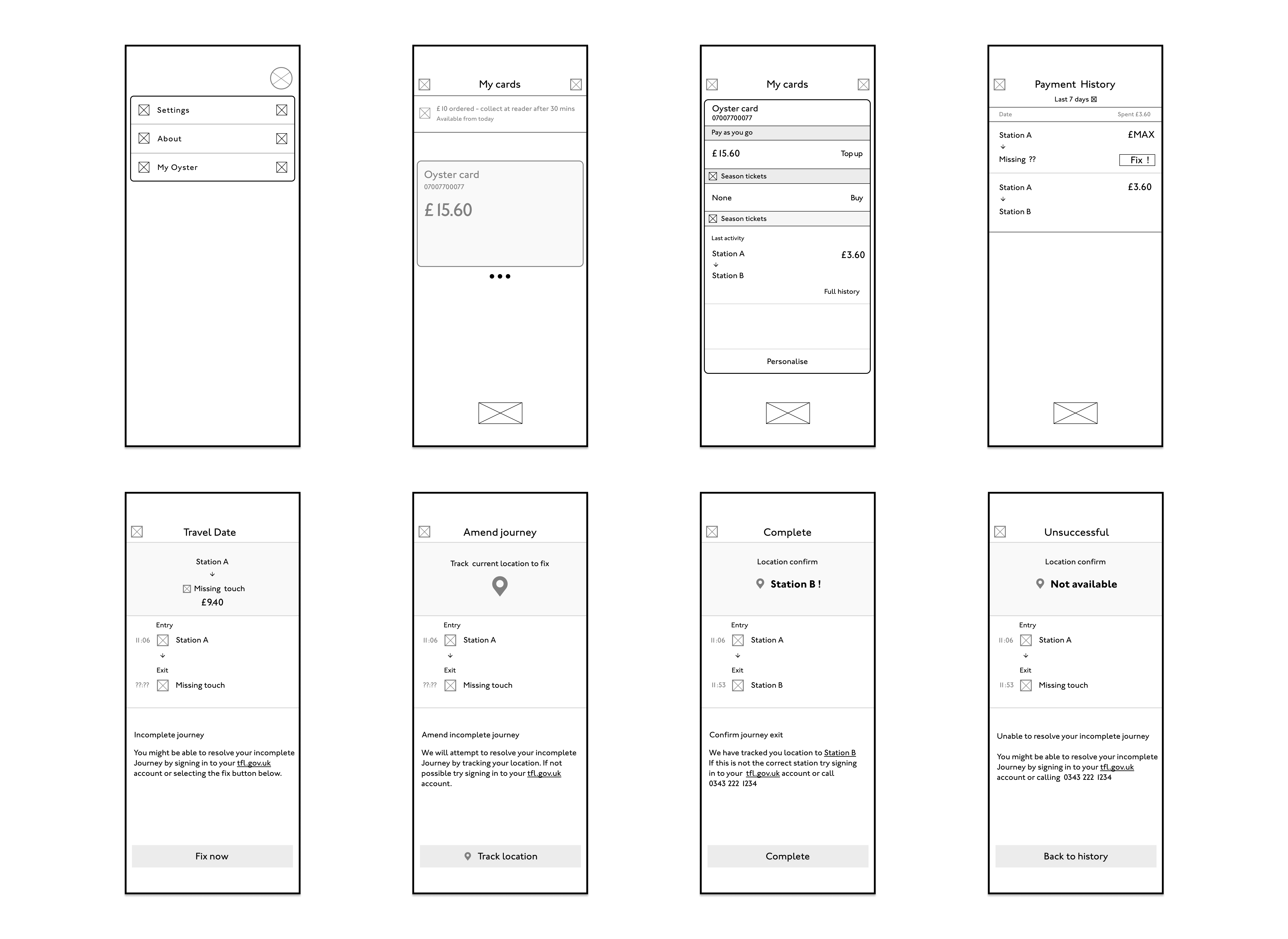
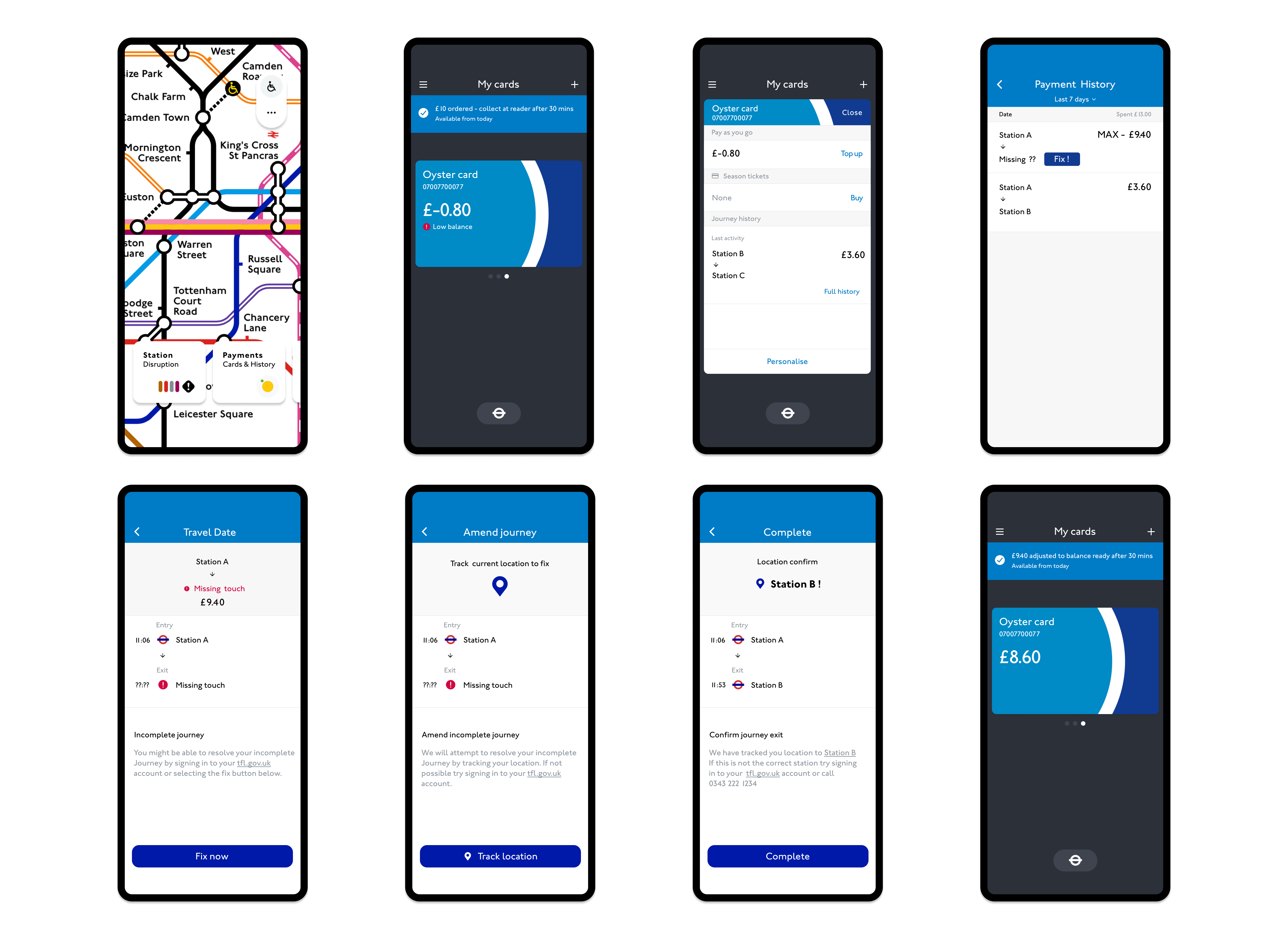
High Fidelity Screens
- User will be able to amend missing journeys by tracking their current location if card readers fail.
- Users will be able to reroute their journeys underground without internet by temporarily halting lines.
- Signage boards should be interactive and provide travellers with information on train frequencies and locations, helping to prevent panic, running, and overcrowding on the wrong trains.
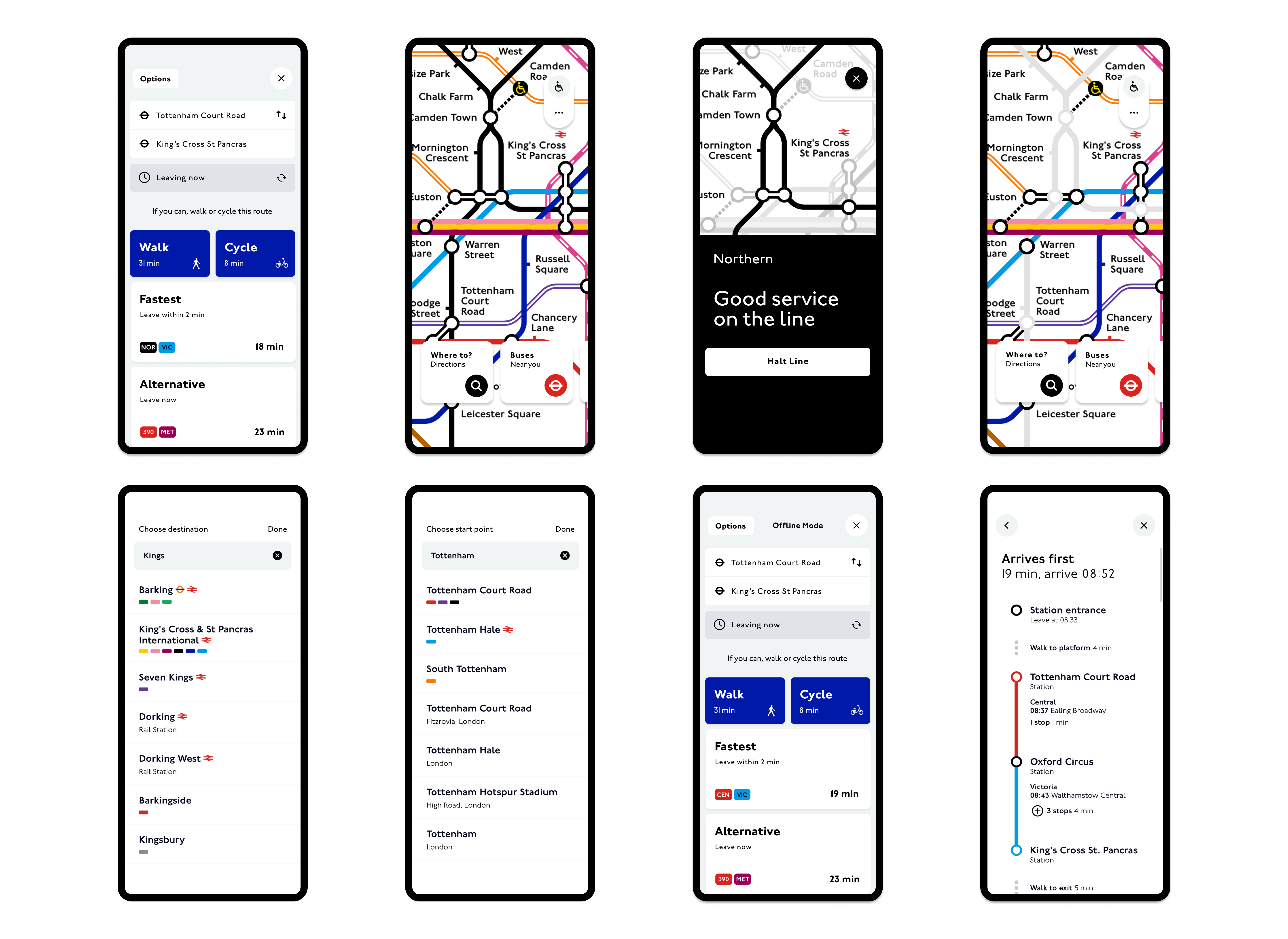
Usability Study Changes
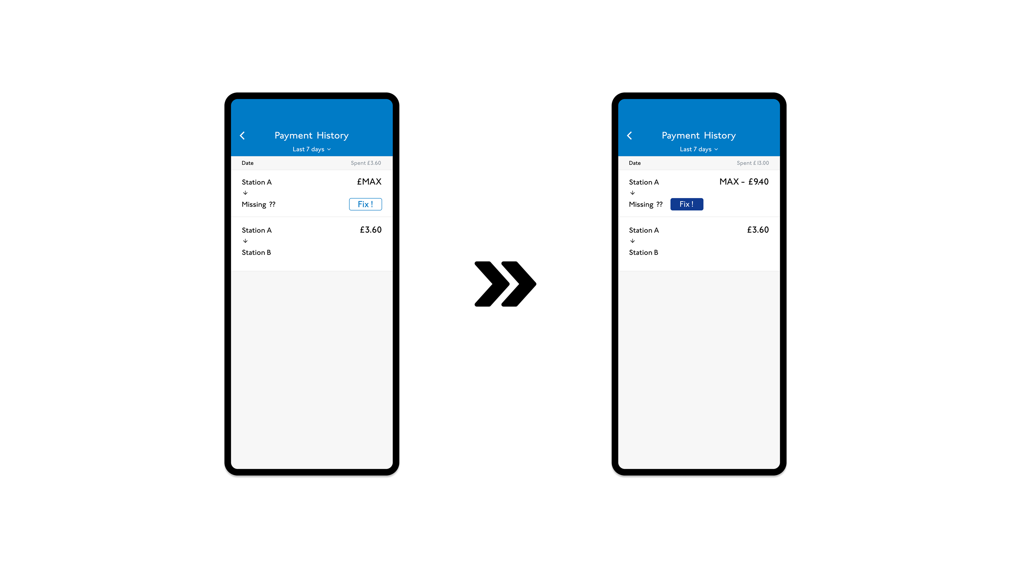
- The user didn’t know the maximum charge, so an actual price needed to be shown.
- The ‘Fix’ button was too far from the missing station text. It needed to be closer to the missing value, as the user was unsure which price would be changed.
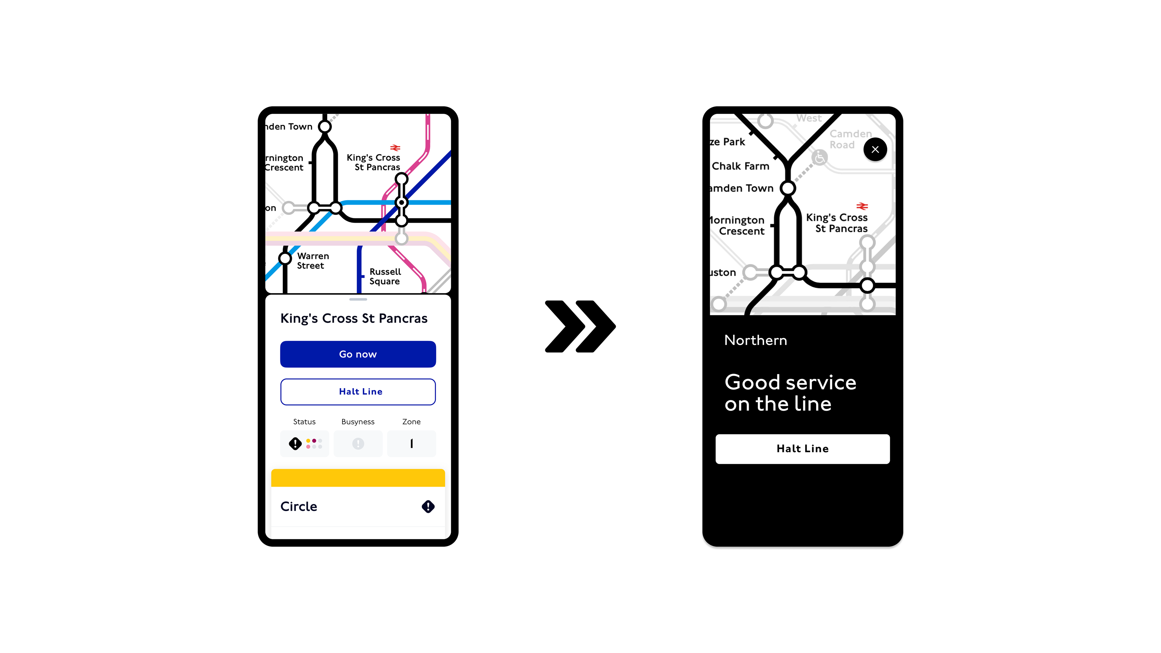
- The user didn’t like the halt line dropdown method. They found it too lengthy and unnecessary, especially in a station with multiple lines. The user preferred to select a physical line on the map.
Prototype Video
Takeaways
Designing the user experience for the London Underground is both unique and challenging. With its vast, intricate network and millions of daily commuters, design solutions must be fast and adaptable to changing circumstances. With such high uncertainty or services and daily challenges that cause delays and standstills, users must be able to make and amend travel plans in an instant, enabling them to reach travel solutions effortlessly in a fast-paced and high-pressure environment.
Design solutions must be easy to use, agile and accessible for regular users, those with disabilities, whether temporary or fixed as well as seasonal guests, such as tourists.
Moving forward it would be useful to work on solutions to improve how cohesively the network works together. Better onboarding, availability and information on how interlinking stations must be used would be essential in improving user experiences and satisfaction using the network.